Android apps keep using Apple’s Liquid Glass design, and it’s killing me
Source: Android Authority
If I wanted Liquid Glass, I’d buy an iPhone. It doesn’t belong on Android. And yet, I’m seeing more and more of Apple’s design language — or half‑baked versions of it — pop up in apps on my Google Pixel.
Android has long been known for its customization options. For that reason, I don’t mind some of the third‑party launchers that have added Liquid Glass‑like design packs. For me, the issue is not about a third‑party developer giving the user the option; to the contrary, the issue is when an app developer chooses Apple’s design language over Google’s Material 3 Expressive as the default, leading to an experience that feels foreign.
Have you noticed Liquid Glass design in apps you use on Android?
22 votes
There Are Levels to This

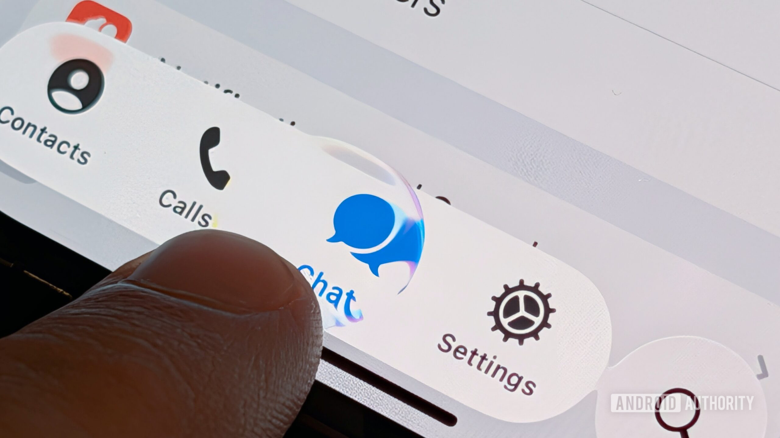
Stephen Headrick / Android Authority
Some apps lean heavily on Liquid Glass design, while others stick closer to Android’s native language. The most recent—and blatant—example is the popular note‑taking app Obsidian. After a recent update, its UI feels almost identical to iOS: circular floating buttons at the top‑right and top‑left of each screen, a floating bar at the bottom, and a near‑absence of color.
The app feels native and snappy, but it would benefit from a few Android‑specific tweaks.
Suggested changes for Obsidian
-
Redesign the top‑right/left floating buttons
- Take inspiration from Google’s Screenshots app.
- Use a “squished” circle (narrower top/bottom, longer sides).
- Remove the drop‑shadow and keep the buttons flat—typical of Android UI.

Stephen Headrick / Android Authority -
Integrate Material You theming
- Allow the app to adopt the device’s dynamic color palette.
- Apply the accent color to the floating buttons, toolbar, and other UI elements—just like Gmail or Google Messages do.
- This makes the app feel cohesive with the rest of the system, especially for users who change their color scheme seasonally.
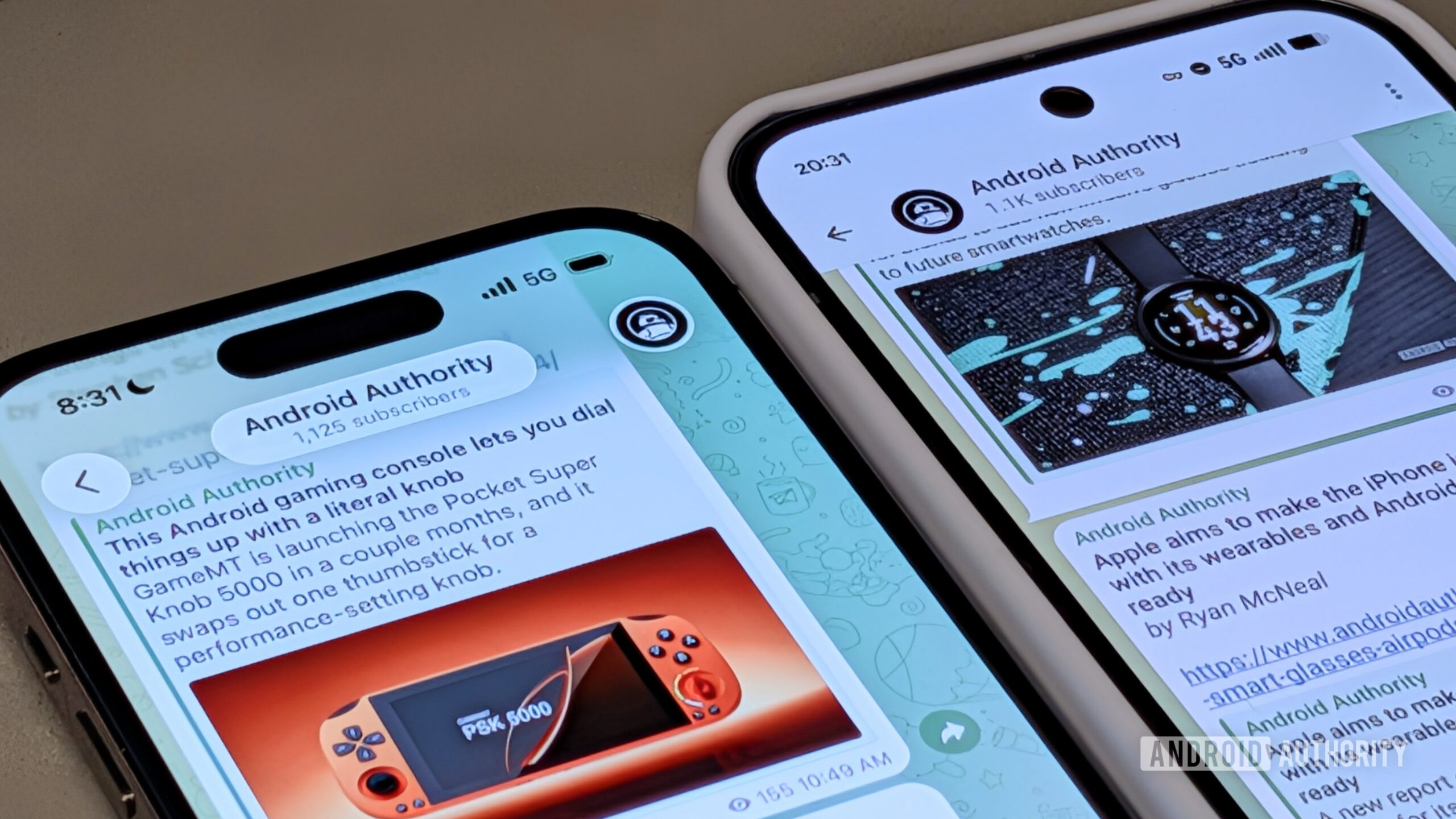
A broader look: Telegram
Telegram’s Android client also suffers from a mixed‑mess design. The recent overhaul introduced a watered‑down iOS‑style look for channel screens, while personal chats retain the older Android design.

Stephen Headrick / Android Authority
-
Pros:
- Smooth, high‑quality animations.
- Generally design‑forward approach.
-
Cons:
- Inconsistent design language (iOS‑like for channels, Android‑like for chats).
- No clear commitment to either Material You or a distinct proprietary system.
Takeaway
If a company wants to create its own design system, that’s perfectly fine—just be consistent. Mixing Liquid Glass elements with a proprietary style results in a hodgepodge that feels “not Android.” Properly applying Material You (or any coherent design language) would make these apps feel at home on the platform.
Have It Your Way, but Go All‑In
As I alluded to, I’m alright with a company designing its own UI. This can help a company keep its brand identity uniform across all the platforms it operates on. A good example of this is Robinhood. You won’t find any bits of Liquid Glass or Material 3 Expressive in its apps, but you will see a consistent design system that you can count on from Robinhood, no matter where you’re accessing it from.
I feel like I’m using a wannabe iPhone app on my Android phone.
Usually, developing a custom design system like Robinhood’s requires a lot of resources, which is why many developers choose to use components provided in a platform’s native tooling. In the case of Telegram—although it’s not a small developer by any means—it still chose to use some native tooling, but it’s completely lacking in consistency on Android. Its iPhone app was quickly updated to adhere to Liquid Glass guidelines and animations, while the Android version still feels like a wannabe iPhone app.
I get it: these apps are businesses. Businesses like to save money where they can, and using a single design across multiple platforms is definitely a cost‑cutter. All I’m asking for is a little more love for the Android side.
When Google announced Material 3 Expressive, it showcased extremely bold ideas for what apps might look like with the evolved design language. We’re approaching a year since that announcement, and I don’t see anything remotely close to what Google showcased—even from Google itself. Material 3 Expressive has so much potential, and I really don’t want it to go to waste.
Thank you for being part of our community. Please read our Comment Policy before posting.