Understanding Word2Vec – Part 4: Visualizing Word Vectors
Source: Dev.to
Visualizing Word Vectors
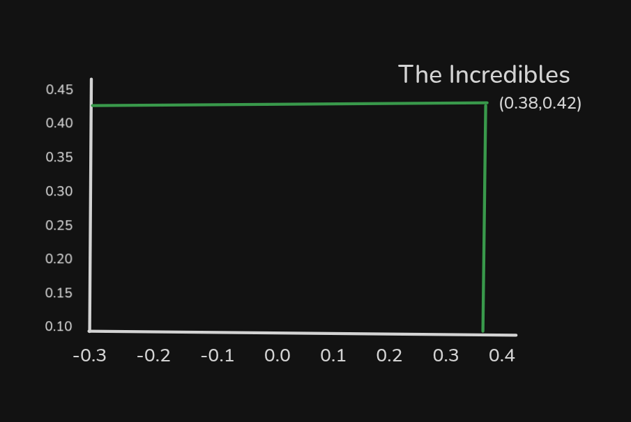
Before we optimize all the weights, remember that these weights represent the numbers associated with each word. Since this example uses two weights for each word, we can plot each word on a graph.
The graph uses:
- x‑axis – weight values connected to the top activation function
- y‑axis – weight values connected to the bottom activation function
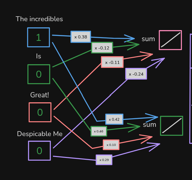
For example, “The Incredibles” is plotted here:
When we plot the other words, the graph looks like this:
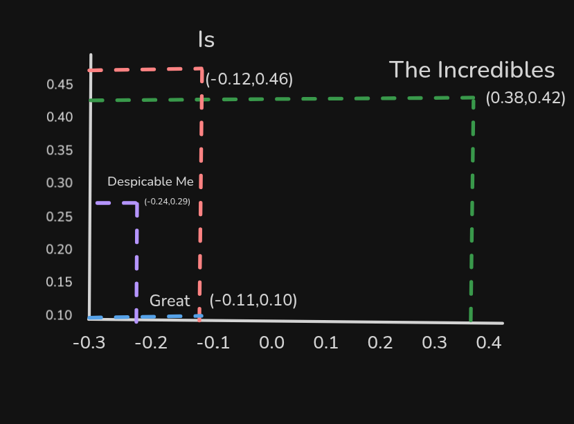
In this graph, the words “Despicable Me” and “The Incredibles” are currently not similar to each other. However, in the training data both appear in the same context:
- The Incredibles is great!
- Despicable Me is great!
We therefore expect back‑propagation to adjust their weights, making them more similar.
What’s Next?
In the next article we’ll see how the graph changes after training.
Installerpedia (optional tool)
Looking for an easier way to install tools, libraries, or entire repositories? Try Installerpedia, a community‑driven, structured installation platform that lets you install almost anything with minimal hassle and clear, reliable guidance.
ipm install repo-name
🔗 Explore Installerpedia here: https://hexmos.com/freedevtools/installerpedia/