Understanding ReLU Through Visual Python Examples
Source: Dev.to
Using the ReLU Activation Function
In the previous articles we used back‑propagation and plotted graphs to predict values correctly. All those examples employed the Softplus activation function.
Now let’s switch to the ReLU (Rectified Linear Unit) activation function, one of the most popular choices in deep learning and convolutional neural networks.
Definition
[ \text{ReLU}(x)=\max(0,;x) ]
The output range is 0 to ∞.
Assumed Parameter Values
w1 = 1.70   b1 = -0.85
w2 = 12.6   b2 = 0.00
w3 = -40.8  b3 = -16
w4 = 2.70
We will use dosage values from 0 to 1.
Step 1 – First Linear Transformation ((w_1, b_1)) + ReLU
| Dosage | Linear term (w_1·x + b_1) | ReLU output |
|---|---|---|
| 0.0 | (0·1.70 + (-0.85) = -0.85) | 0 |
| 0.2 | (0.2·1.70 + (-0.85) = -0.51) | 0 |
| 0.6 | (0.6·1.70 + (-0.85) = 0.17) | 0.17 |
| 1.0 | (1·1.70 + (-0.85) = 0.85) | 0.85 |
As the dosage increases, the ReLU output stays at 0 until the linear term becomes positive, after which it follows a straight line – a “bent blue line”.
Demo code
import numpy as np
import matplotlib.pyplot as plt

x = np.linspace(0, 1, 100)
w1, b1 = 1.70, -0.85

z1 = w1 * x + b1
relu1 = np.maximum(0, z1)

plt.plot(x, relu1, label="ReLU(w1·x + b1)")
plt.xlabel("Dosage")
plt.ylabel("Activation")
plt.title("ReLU Activation")
plt.legend()
plt.show()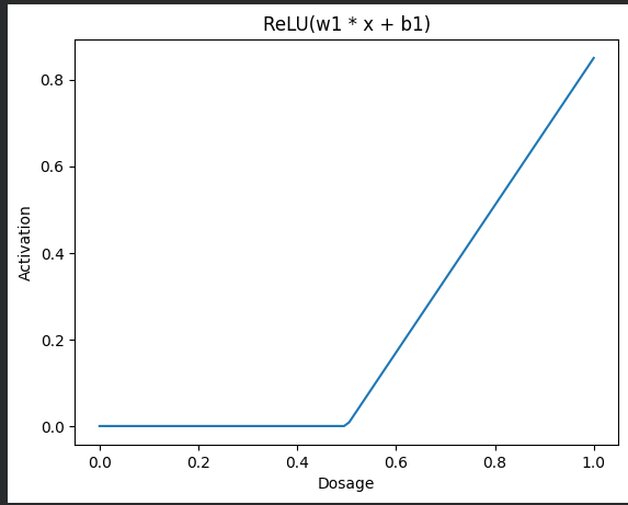
Step 2 – Multiply the ReLU Output by (w_3 = -40.8)
Multiplying the bent blue line by ‑40.8 flips it downward and scales its magnitude.
Demo code
w3 = -40.8
scaled_blue = relu1 * w3

plt.plot(x, scaled_blue, label="ReLU × w3")
plt.xlabel("Dosage")
plt.ylabel("Value")
plt.title("ReLU Output × w3")
plt.legend()
plt.show()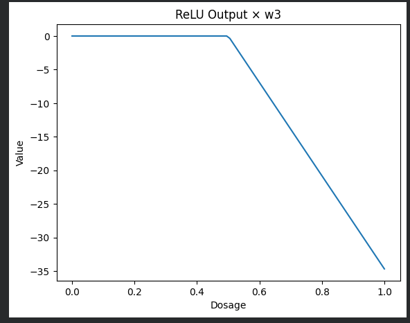
Step 3 – Bottom Node ((w_2, b_2))
Since (b_2 = 0), the transformation (w_2·x + b_2) yields a straight orange line.
Demo code
w2, b2 = 12.6, 0.0

z2 = w2 * x + b2

plt.plot(x, z2, color="orange", label="w2·x + b2")
plt.xlabel("Dosage")
plt.ylabel("Value")
plt.title("Bottom Node")
plt.legend()
plt.show()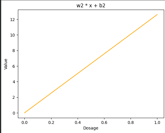
Step 4 – Multiply Bottom Node by (w_4 = 2.70)
Demo code
w4 = 2.70
scaled_orange = z2 * w4

plt.plot(x, scaled_orange, color="orange", label="(w2·x + b2) × w4")
plt.xlabel("Dosage")
plt.ylabel("Value")
plt.title("Scaled Bottom Node")
plt.legend()
plt.show()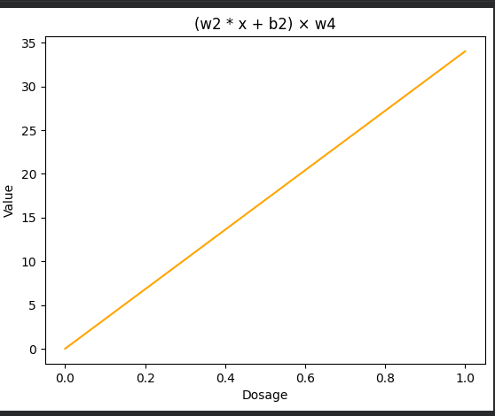
Step 5 – Add the Two Paths Together
The sum of the bent blue line and the straight orange line creates a green wedge‑shaped curve.
Demo code
combined = scaled_blue + scaled_orange

plt.plot(x, combined, color="green", label="Combined Signal")
plt.xlabel("Dosage")
plt.ylabel("Value")
plt.title("Combined Signal")
plt.legend()
plt.show()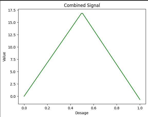
Step 6 – Add Bias (b_3 = -16)
Finally, we shift the combined signal downward by the bias term.
Demo code
b3 = -16
combined_bias = combined + b3

plt.plot(x, combined_bias, color="green", label="Combined + b3")
plt.xlabel("Dosage")
plt.ylabel("Value")
plt.title("Combined Signal + Bias")
plt.legend()
plt.show()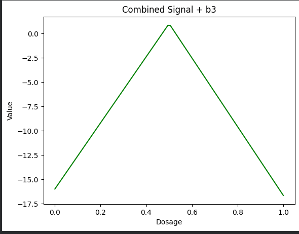
Summary
By replacing Softplus with ReLU and following the linear‑transform‑scale‑add steps, we obtain a piecewise‑linear model that can be visualized at each stage. The code snippets above can be run as‑is to reproduce all the plots.
Step 7 – Apply ReLU Again
Now we apply ReLU over the green wedge. This converts all negative values to 0 and keeps positive values unchanged.
Demo code
final_output = np.maximum(0, combined_bias)

plt.plot(x, final_output, color="green")
plt.xlabel("Dosage")
plt.ylabel("Activation")
plt.title("Final ReLU Output")
plt.show()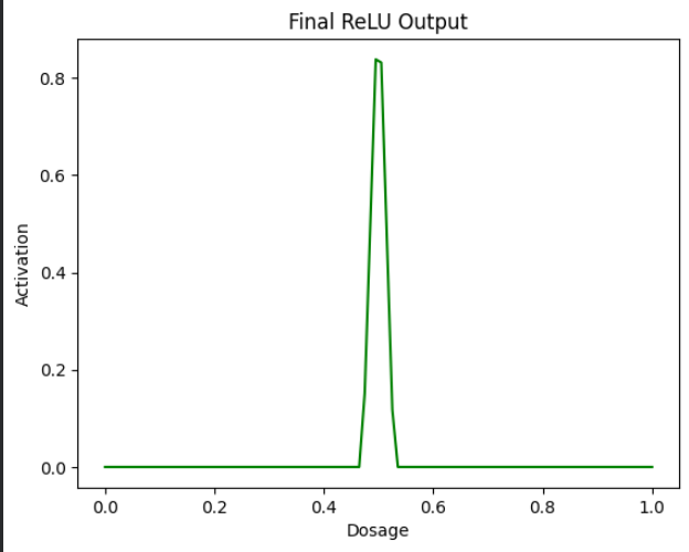
So this is our final result, where we plotted a curve using ReLU, making it more realistic for real‑world situations.
We will explore more on neural networks in the coming articles.
You can try the examples out in the Colab notebook.
Looking for an easier way to install tools, libraries, or entire repositories?
Try Installerpedia – a community‑driven, structured installation platform that lets you install almost anything with minimal hassle and clear, reliable guidance.
ipm install repo-name
🔗 Explore Installerpedia here: https://hexmos.com/freedevtools/installerpedia/