Here’s how you’ll control and navigate Android XR glasses
Source: 9to5Google
Android XR glasses are coming in 2026. Here’s what you can expect from the user interface and experience.
Since December, Google has offered design documentation and other development tools to let developers build Android XR apps for glasses. There are two form factors, officially called:
- AI Glasses – feature speakers, a microphone, and a camera.
- Display AI Glasses – add a small screen. Single‑display models are monocular; dual‑screen models are binocular and will arrive later.
You as the wearer can turn off the display at any time, so apps must remain fully functional in audio‑only mode.
Hardware
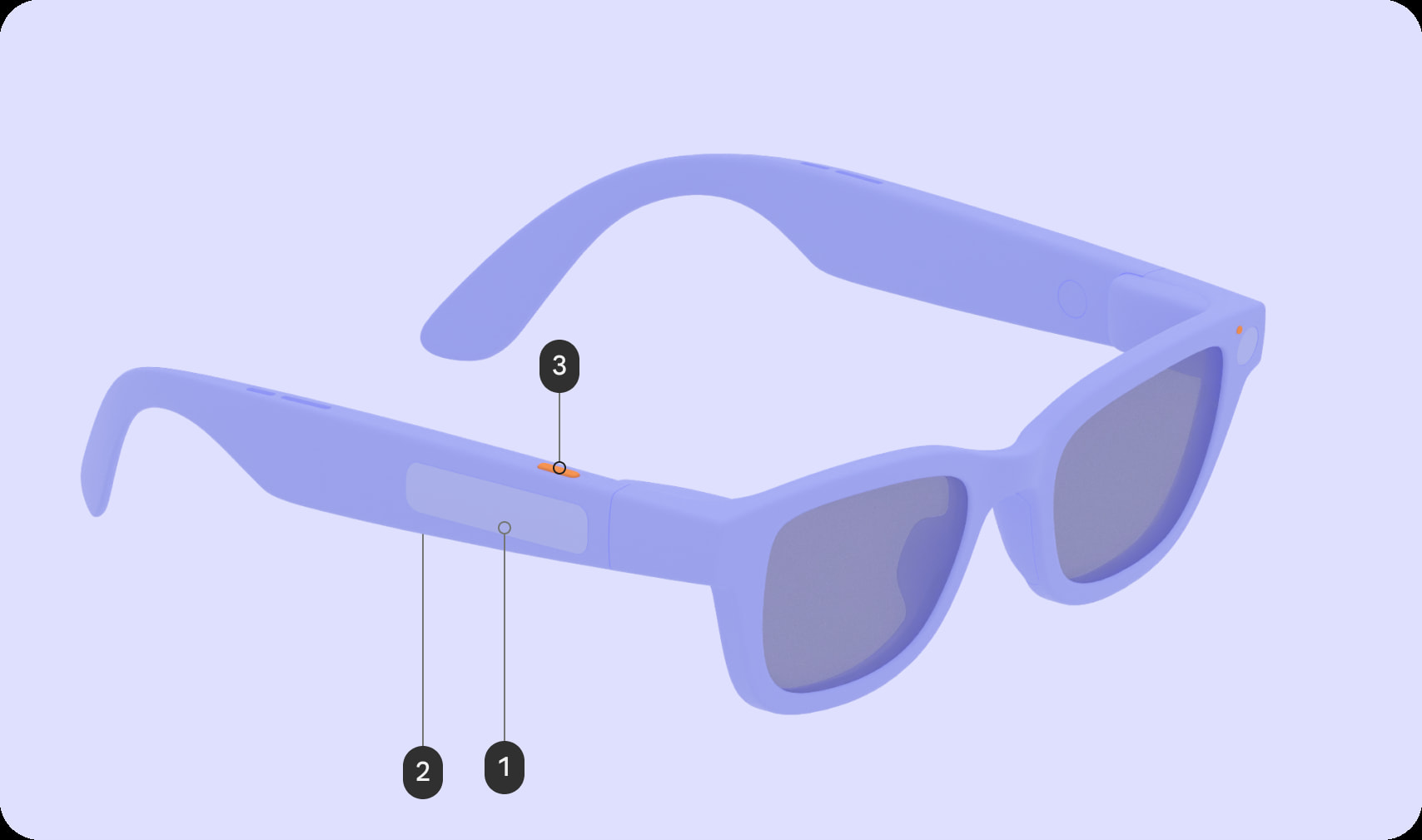
Google mandates the following physical controls on all Android XR glasses:
- Power switch/button
- Touchpad (two‑finger capable)
- Camera button
- Display button (on models with a screen, placed on the underside of the stem)
- Camera button – tap to take a photo, hold to record video, press again to stop, double‑press to launch the Camera app.
- Display button – toggles “Wake/Sleep” for audio‑only mode.
Touchpad gestures
- Tap – Play / Pause / Confirm
- Touch & hold – Invoke Gemini
- Swipe
- Audio: Next / Previous / Dismiss
- Display: UI navigation (scroll lists, move focus, click buttons)
- Two‑finger swipe – Adjust volume
- Swipe down – Display: Back (returns to the Home Screen or previous screen)

The glasses also include two LEDs—one visible to the wearer and one to bystanders. These LEDs provide system UI feedback (e.g., feature and device states) and cannot be customized.

Software
Home screen
On Display AI Glasses, the Home screen functions like a phone’s lock screen. At the bottom is an always‑visible system bar showing time, weather, notifications, alerts, chips, and Gemini visual feedback.

Above the system bar you’ll find:
- Contextual, glanceable information without requiring input
- Shortcuts to common actions
- Multitasking capabilities when multiple activities run simultaneously

Notifications
Notifications appear as pill‑shaped chips that expand when focused.

Design language – “Glimmer”
The UI design language for Android XR glasses is called Glimmer. Key guidelines include:
- Rounded corners – avoid sharp corners that draw the eye into visual pockets.
- Color considerations – optical‑see‑through displays consume varying power by color. Green is the least power‑hungry; blue consumes the most. Minimize lit pixels and avoid full‑white screens to reduce heat.
- Icon style – use unfilled icons to prevent light bleed/halation. Google recommends Material Symbols Rounded for standard iconography.
Jetpack Compose Glimmer components
Jetpack Compose provides Glimmer‑optimized UI components:
- Buttons
- Title chip (short title, name, or status; equivalent to app/top bars on mobile)
- Cards
- Lists
- Stack (collapsed list showing one piece of content at a time, e.g., a notification or card)
