Graphing CLT-Central Limit Theorem- by using Pandas and Matplotlib
Source: Dev.to
Central Tendency
Statistics cares about the central tendency and answers the question, “How is our data going to be distributed?”
To understand a distribution you need:
- The centre – where most of the data lie.
- How each value varies from the centre – the spread.
- The outliers – extreme values.
To describe the centre we focus on three measures:
| Measure | Description |
|---|---|
| Mean | A single numerical figure that represents the centre of an entire distribution of data. |
| Median | The middle value in an ordered set of data. |
| Mode | The value that occurs most frequently in the set. |
Shape of the Distribution
Knowing the centre is not enough; we also need to describe the shape of the distribution. Two additional concepts do this:
- Skewness – the asymmetry of the distribution; it tells you which way the “tail” of the graph is leaning.
- Kurtosis – the “tailedness” or peak of the distribution; it tells you how much of the data sits in the tails versus the centre.
If you get lost, here are the three questions you can answer once you have these values:
- Where is it? (Mean)
- Is it lopsided? (Skewness)
- Is it pointy or flat? (Kurtosis)
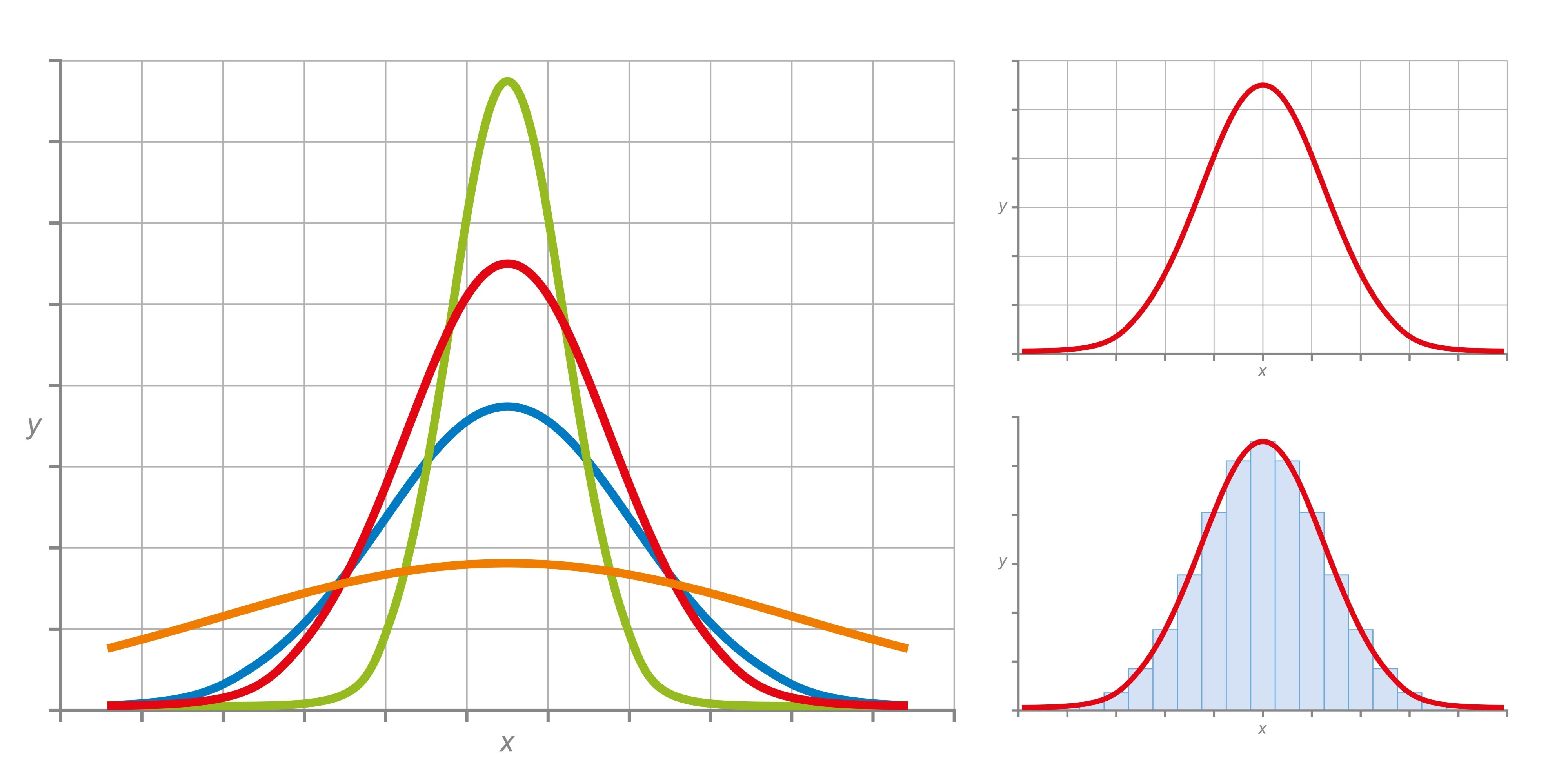
Variance and Standard Deviation
The second moment (or variance) tells you how tightly the data are clustered around the centre.
Variance answers the question: “How much is the crowd huddling or spreading out?”
From variance we obtain the standard deviation, which is expressed in the same units as the original data.
Interpretation
| Situation | Description |
|---|---|
| Low variance | Data points are very close to the mean; the graph looks like a tall, narrow spike. |
| High variance | Data points are spread far from the mean; the graph looks wide and stretched out. |
Central Limit Theorem (CLT)
“Not all populations are normally distributed; but with the CLT we can obtain a normal distribution of sample means.”
What the CLT Says
-
Sample means equal the population mean – If you repeatedly draw samples (of size n) from any population (normal or not) and compute each sample’s mean, the distribution of those sample means will be centred at the true population mean.
-
Standard error is smaller than the population standard deviation – The spread of the sample‑mean distribution (the standard error) is
[ \text{Standard Error (SE)} = \frac{\sigma}{\sqrt{n}} ]
where (\sigma) is the population standard deviation and (n) is the sample size.
Conditions for the CLT
For the theorem to hold, the following conditions should be satisfied:
- Sufficiently large sample size – Usually (n \ge 30). If the underlying population is heavily skewed or contains many outliers, a larger (n) may be needed.
- Independent and identically distributed (i.i.d.) samples – Each observation must be drawn randomly from the same population and be independent of the others.
- Finite population variance – The population must have a finite variance. Distributions with infinite variance (e.g., the Cauchy distribution) do not satisfy the CLT.
Source: DataCamp – Central Limit Theorem
Example
The following example illustrates the two key properties of the CLT.
Scenario: A professor gave an 8‑point quiz to a small class of four students. The scores were 2, 6, 4, and 8. For the sake of discussion, assume these four students constitute the entire population.
Steps to Show that the Sample Mean Equals the Population Mean
- Calculate the population mean and standard deviation.
- Take samples (with replacement) from the population and compute the mean of each sample.
- Observe that the distribution of those sample means is centred at the population mean, and its spread follows the standard‑error formula above.
(The detailed calculations are left as an exercise.)
Proof that the Sample Mean Equals the Population Mean
Population
The population consists of the four values
[ {2,;4,;6,;8} ]
Mean of the population
[ \mu = \frac{\sum X}{N}= \frac{2+4+6+8}{4}= \frac{20}{4}=5 ]
Standard deviation (σ)
Step‑by‑step arithmetic:
- Calculate deviations
| (X) | (X-\mu) |
|---|---|
| 2 | (-3) |
| 4 | (-1) |
| 6 | (+1) |
| 8 | (+3) |
- Square the deviations
| ((X-\mu)^2) |
|---|
| (9) |
| (1) |
| (1) |
| (9) |
- Sum the squared deviations
[ SS = 9+1+1+9 = 20 ]
- Compute the variance and standard deviation
[ \sigma^2 = \frac{SS}{N}= \frac{20}{4}=5 \qquad\Longrightarrow\qquad \sigma = \sqrt{5}\approx 2.236 ]
Note: The population is clearly not normally distributed (see the plot below).

Sampling from the Population
We repeatedly draw samples of size 2 (with replacement) and compute the sample mean (\bar{x}) for each pair.
All possible ordered pairs and their means are listed below.
| Sample | (\bar{x}) |
|---|---|
| (2, 2) | 2 |
| (2, 4) | 3 |
| (2, 6) | 4 |
| (2, 8) | 5 |
| (4, 2) | 3 |
| (4, 4) | 4 |
| (4, 6) | 5 |
| (4, 8) | 6 |
| (6, 2) | 4 |
| (6, 4) | 5 |
| (6, 6) | 6 |
| (6, 8) | 7 |
| (8, 2) | 5 |
| (8, 4) | 6 |
| (8, 6) | 7 |
| (8, 8) | 8 |
Frequency Distribution of Sample Means
| (X) (sample mean) | (f) | (f\cdot X) |
|---|---|---|
| 2 | 1 | 2 |
| 3 | 2 | 6 |
| 4 | 3 | 12 |
| 5 | 4 | 20 |
| 6 | 3 | 18 |
| 7 | 2 | 14 |
| 8 | 1 | 8 |
| Total | 16 | 80 |
[ \bar{x} = \frac{\sum (f\cdot X)}{\sum f}= \frac{80}{16}=5 ]
The distribution of the sample means is shown below; as the number of samples grows, the shape approaches a normal distribution (Central Limit Theorem).

Extending the Example
Now we increase the population to six values
[ {2,4,6,8,10,12} ]
and draw samples of size 3 (with replacement).
There are (6^3 = 216) possible ordered triples.
Below is a truncated view of the generated triples (the full list is produced by the Python code later).
Starting with 2
(2, 2, 2) (2, 2, 4) (2, 2, 6) (2, 2, 8) (2, 2,10) (2, 2,12)
(4, 2, 2) (4, 2, 4) (4, 2, 6) (4, 2, 8) (4, 2,10) (4, 2,12)
...
Starting with 12
(12,12, 2) (12,12, 4) (12,12, 6) (12,12, 8) (12,12,10) (12,12,12)
Python Implementation
The full notebook is available on Kaggle:
Proofing CLT – Central Limit Theorem (Pandas)
It contains the CSV file samples_and_means.csv used for the plots.
# Import libraries
import pandas as pd
import matplotlib.pyplot as plt

# Load the data generated from the 216 triples
data = pd.read_csv("/kaggle/input/sample-mean-of-the-our-samples/samples_and_means.csv")
df   = pd.DataFrame(data)

# Plot the distribution of sample means
plt.figure(figsize=(8,5))
df['sample_mean'].hist(bins=20, edgecolor='black')
plt.title('Distribution of Sample Means (n=3, population = {2,4,6,8,10,12})')
plt.xlabel('Sample Mean')
plt.ylabel('Frequency')
plt.show()
Running the above code reproduces a histogram that clearly demonstrates the normal‑shaped sampling distribution, even though the underlying population is uniformly spaced and not normal.
Take‑away
- The population mean is (\mu = 5).
- The mean of all possible sample means (for any sample size) is also (\mu).
- As the sample size (n) increases, the distribution of the sample mean becomes increasingly normal, illustrating the Central Limit Theorem.
Series and Count the Values
First, count the values and reset the index so they can be used in the graphing steps.
Then, sort the values by the mean.
# Count the values, reset the index, and sort by the mean
counts = df["Mean"].value_counts().reset_index().sort_values("Mean")
counts

# Visualize using the index and values
counts.plot(kind="bar", x="Mean", y="count", color="salmon")
plt.xlabel('Category')
plt.ylabel('Frequency')
plt.show()
Output
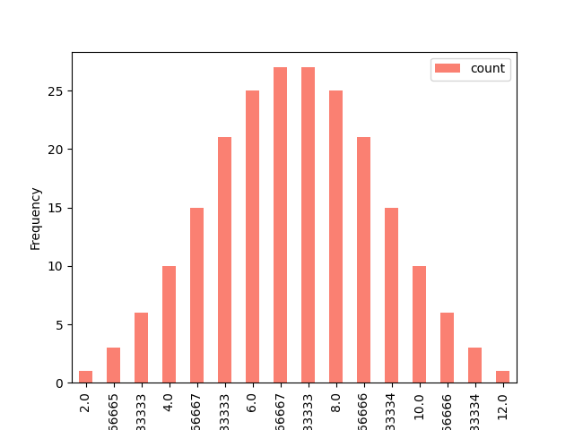
Final Thought
We can see that the graph is becoming normally distributed. Since we’ve reached this conclusion, solving problems becomes easier.
Why This Is Important in Statistics
- Predictability from Chaos: No matter how “weird” or skewed your original population distribution is, the distribution of the sample means will always pull toward a Normal Distribution (a bell curve) as your sample size (n) increases.
- The Center Holds: The mean of all your sample means will be exactly equal to the original population mean.
- Reduced Risk: As you take larger samples, the spread (Standard Error) of those sample means gets smaller, making your estimates much more precise.
Stay Connected
I’ve built this series to share my journey in learning data science. Feel free to subscribe if you’re interested in following my progress. Thanks!
- Series:
- LinkedIn:
If you think I’m mistaken, please don’t hesitate to reach out.