Schemas and Data Modelling in Power BI

Published: (February 2, 2026 at 02:08 PM EST)
7 min read
Source: Dev.to

Source: Dev.to

Data Modelling in Power BI

Power BI instantly conjures images of dashboards—colorful charts, large numeric cards, clickable slicers, and polished visuals. Those are the elements users interact with, so it’s natural to think they’re what makes a report “good.”

In reality, dashboards are only the final layer. Long before any visual appears on the screen, critical decisions have already been made. Those decisions determine whether a report is fast or slow, reliable or misleading, intuitive or frustrating. That earlier—and often invisible—stage is data modelling.

Data modelling is the process of organizing data so that Power BI understands what the data represents and how the different pieces relate to one another. It involves deciding:

  • Which tables are needed?
  • What each table should contain?
  • How those tables should be connected?

When the structure is well‑designed, Power BI feels logical and predictable. When it isn’t, even simple questions can return confusing or incorrect results. In other words, the quality of a Power BI report is decided before the first chart is ever created.

What “Schema” Means in Power BI

In Power BI, a schema is the overall structure of the data model. It isn’t an abstract concept; it’s the actual layout you see in Model view, including the tables and the relationships between them.

A schema answers very practical questions:

  • What tables exist in the model?
  • Which tables store measurements, and which store descriptive data?
  • When a user clicks a slicer, how does Power BI know which data to include?

Power BI does not “reason” about data the way a human does. It follows the paths you define. The schema determines:

  • How filters move from one table to another,
  • How totals and averages are calculated,
  • How fast visuals respond when users interact with the report.

Two schema patterns appear most frequently in Power BI models:

  • Star schema
  • Snowflake schema

Star Schema vs Snowflake Schema

Understanding the difference between these two explains why some Power BI models feel simple and trustworthy, while others feel fragile and unpredictable.

Fact Tables and Dimension Tables: Understanding Their Roles

Most Power BI models are built using two types of tables. Knowing what each does is the foundation of data modelling.

Fact Tables – Recording What Happened

A fact table records events. Each row represents something that actually occurred.

In a dataset such as Kenya crops data, a single row in the fact table might represent:

  • a specific crop,
  • grown in a specific county,
  • during a specific year or season,
  • with a measurable outcome such as yield in kilograms.

Because these events are recorded repeatedly over time, fact tables typically:

  • Grow very large,
  • Repeat the same crops or counties many times,
  • Focus on numeric values that can be summed, averaged, or counted.

A fact table does not explain what a crop is or where a county is located; it simply records that something happened.

Dimension Tables – Giving Meaning to the Events

Dimension tables describe and contextualize the facts. Instead of repeating names and descriptions in every row of the fact table, that information is stored once in separate tables, such as:

  • a Crop table that stores crop names and types,
  • a County table containing county names,
  • a Date table containing years or seasons.

Dimension tables typically:

  • Change slowly compared to fact tables,
  • Contain descriptive rather than numerical data,
  • Are used to filter, group, and label results in reports.

When you select a county or crop in a slicer, Power BI relies on the dimension table to determine which rows in the fact table should be included. This separation is what makes analysis both efficient and accurate.

The Star Schema: A Structure That Matches How Power BI Thinks

The star schema is the most effective and widely recommended structure for Power BI models.

In a star schema:

  • One fact table sits at the center (e.g., crop‑yield records).
  • Each dimension table connects directly to that fact table (crop, county, date).
  • Dimension tables do not connect to each other.

Star Schema

How Filtering Works in a Star Schema

When you select a county in a slicer, Power BI:

  1. Looks at the County table.
  2. Identifies the selected county’s unique key.
  3. Follows the relationship directly to the fact table.
  4. Keeps only the matching rows.
  5. Performs calculations using those rows.

Because each dimension connects straight to the fact table, filters move directly to the data being analyzed. Power BI does not need to pass through intermediary tables, so calculations behave consistently. This lets much of the analytical logic be handled by the structure itself, reducing the need for complex DAX formulas later.

Why the Star Schema Performs Better in Power BI

Power BI stores data in columns and is optimized for fast aggregation. It performs best when relationships are simple and unambiguous.

In a star schema you will observe that:

  • Power BI follows one clear relationship path for any filter.
  • Fewer joins are required to answer queries, which speeds up calculations.
  • Ambiguities and circular relationships are avoided, leading to more reliable results.
  • The model is easier to understand, maintain, and extend.

Bottom Line

The visual polish of a dashboard is only the tip of the iceberg. The real foundation of a high‑performing, trustworthy Power BI report is a well‑designed data model—preferably a star schema built from clearly defined fact and dimension tables. Invest time in that invisible layer, and the visuals will automatically become both beautiful and reliable.

The Snowflake Schema: A Bit More Complex

A snowflake schema starts with the same idea as a star schema but splits descriptive information across multiple related tables.

For example, instead of storing all location details in a single County table, the data might be organized as:

  • a County table that stores county information,
  • a Region table that stores regional information,
  • a Country table that stores country information.

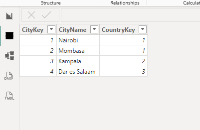
When a user selects a country, Power BI must follow a longer path before reaching the data:

  1. Start at the Country table.
  2. Move to the Region table.
  3. Move to the County table.
  4. Finally reach the Fact table.

Snowflake Schema

Each additional step increases processing work for Power BI and raises the chance of errors if any relationship is incorrect.

While snowflake schemas reduce duplicated data, they create challenges in Power BI because filters must travel through multiple tables and more relationships must be managed. Consequently, it becomes harder to predict how calculations will behave.

For this reason, snowflake schemas are common in source systems but are often reshaped into star schemas for reporting.

Relationships: How Tables Actually Work Together

Relationships define how tables communicate and how filters flow.

When you select a county, crop, or year in a slicer, Power BI does not search the fact table directly. It:

  1. Looks at the dimension table,
  2. Identifies the matching key,
  3. Follows the relationship to the fact table, and
  4. Filters the fact rows accordingly.

In a well‑designed model:

  • each dimension table contains unique values (each crop or county appears once),
  • fact tables contain many related records linked to those values,
  • filters flow from dimension tables to the fact table.

This mirrors real‑world logic: one county can have many crop records, and one crop can appear across many years.

Cardinality: Understanding “One” and “Many”

Cardinality describes how many rows in one table relate to rows in another.

TypeDescription
One‑to‑ManyOne row in a dimension table relates to many rows in the fact table.
One‑to‑OneOne row matches exactly one row in another table (rare in reporting).
Many‑to‑ManyMultiple rows relate to multiple rows (can cause duplicated totals if not handled carefully)

Note: Incorrect cardinality may still produce a result, but those results may not represent reality.

Why Good Data Modelling Matters

Data modelling affects every Power BI report in three key ways.

Performance

Simple structures reduce processing work, resulting in faster visuals and smoother interaction.

Accuracy

Correct relationships ensure each fact is counted once, preventing inflated totals and misleading averages.

Simplicity

Clear models make reports easier to build, understand, and maintain. Complex DAX is often a sign of a model that needs improvement.

Effective models typically:

  • separate measurements from descriptions,
  • use star schemas where possible,
  • define relationships clearly,
  • rely on the model to handle logic instead of forcing visuals to compensate.

When this foundation is solid, Power BI becomes easier to use and easier to trust. Schemas and data modelling directly determine whether Power BI produces reliable insight or confusing results. By understanding fact and dimension tables, choosing appropriate schemas, and defining relationships carefully, analysts create reports that are fast, accurate, and understandable.

For more information, visit the official Microsoft guidance on Power BI.

Feel free to leave a comment sharing how you approach data modelling in your own Power BI projects. Discussion and different perspectives are always welcome.

Back to Blog

Related posts

Read more »

POWER BI - SCHEMAS & MODELLING GUIDE.

What is Power BI? Power BI is a Business Intelligence tool built by Microsoft that turns raw data into interactive insights. It has a very user‑friendly interf...