I tried the redesigned Google Wallet app, and it fixes my 2 biggest complaints
Source: Android Authority
Joe Maring / Android Authority
It’s a big deal whenever Google redesigns one of its Android apps, especially for an app as central as Google Wallet. We’ve been tracking evidence of a major update since last September, and after months of waiting, it’s finally live.
Google began rolling out the Wallet redesign on April 10. After using it on my Pixel 10a for about a day, I can confirm that the new design was worth the wait. Here’s what it looks like in action.
What I love about the redesigned Google Wallet
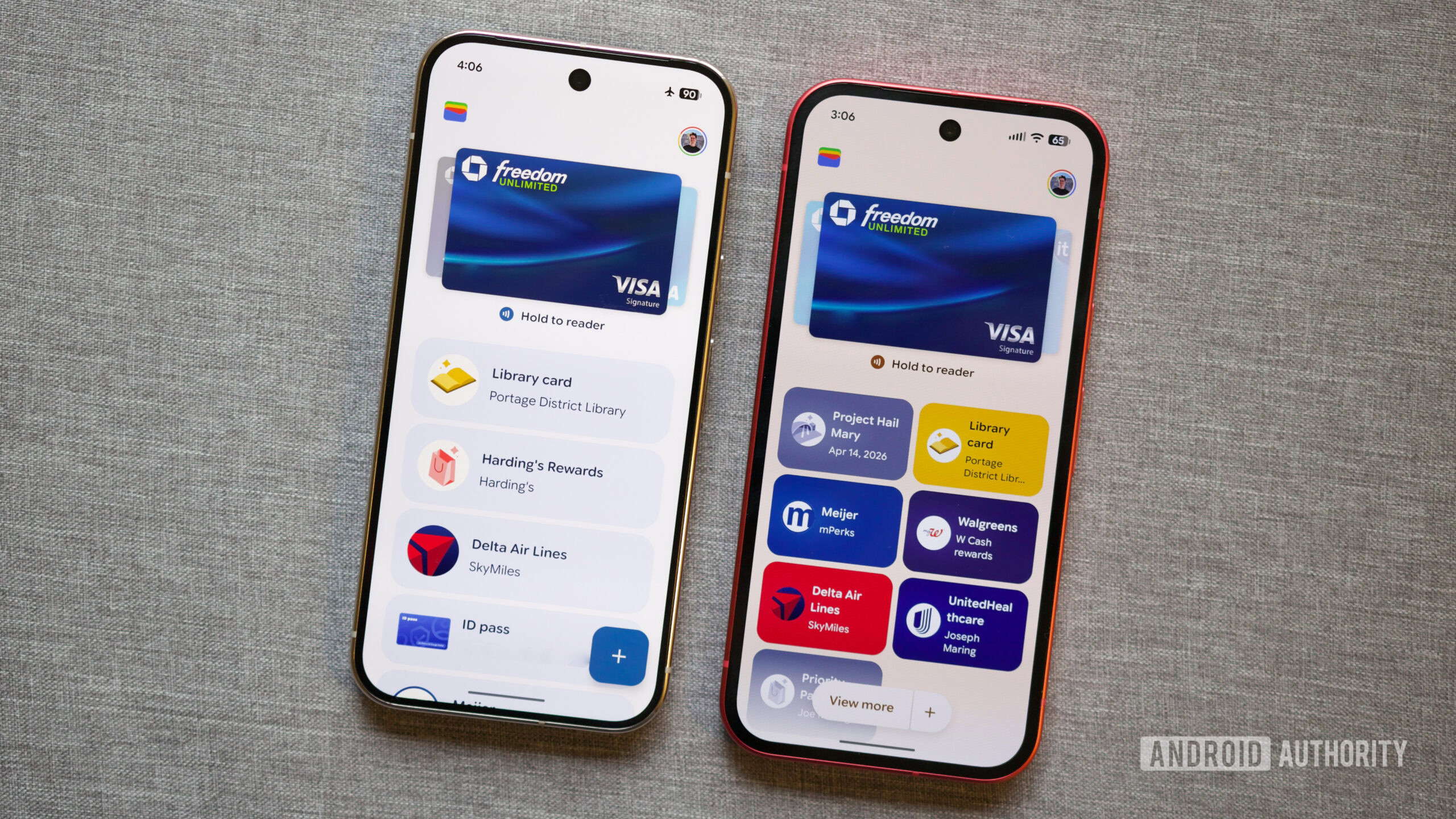
Old Google Wallet UI (left) and the new Google Wallet UI.
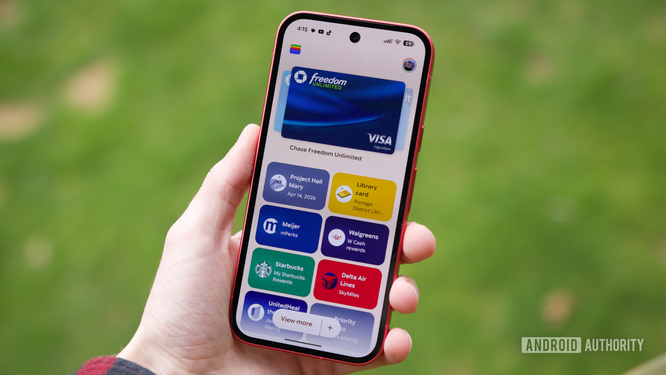
The redesign centers on two big changes to passes.
- Square pass cards – Passes are now displayed as small squares instead of long rectangles. The same amount of space that once held one pass now fits two, letting you see more passes on the screen at once. The visual layout is cleaner while still showing the same information.
- Starred‑only home screen – You can now choose which passes appear on the home screen by starring them. Only starred passes are shown by default; un‑starred passes stay hidden until you view the full list.
You can still press and hold a pass to rearrange it, and tapping a pass reveals its barcode/QR code and full details.
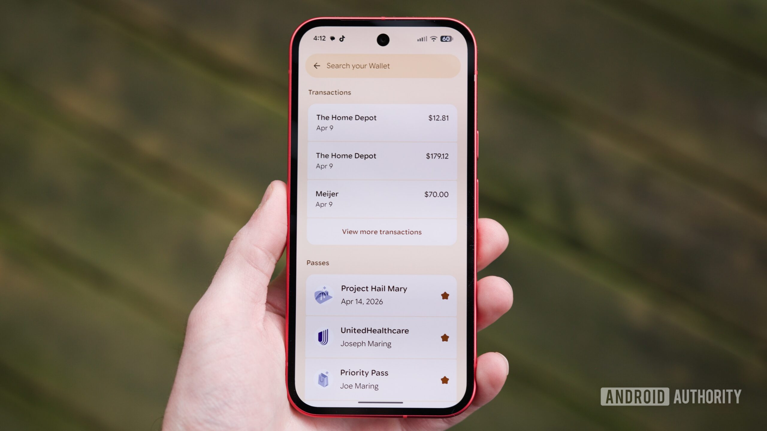
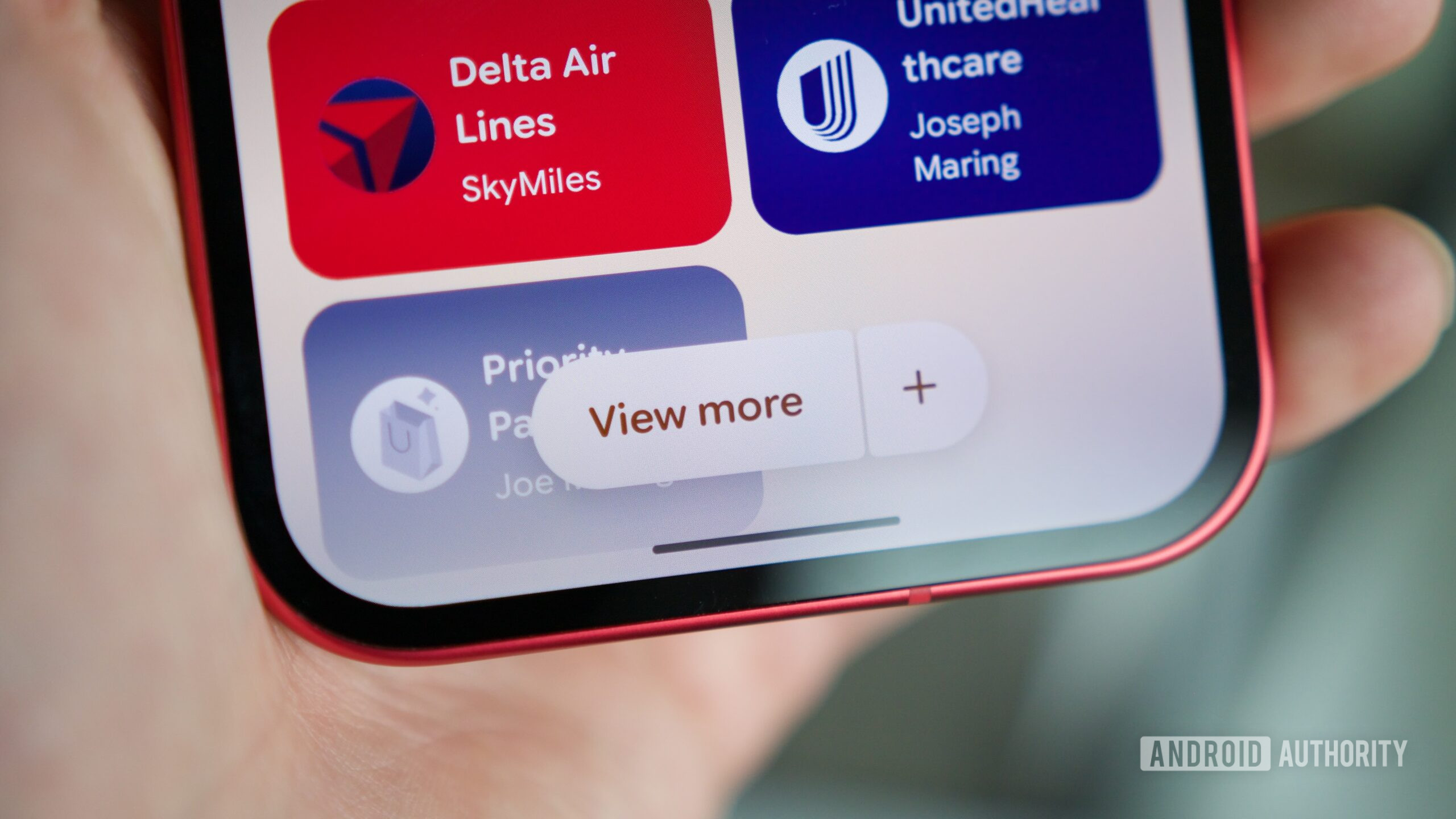
The “View more” button opens a new page with all transactions and the full pass collection.
The View more button takes you to a page that lists all transactions across your payment cards, followed by your complete collection of passes (accessed via View more passes). This is also where you control which passes appear on the home screen—starred passes show up, un‑starred ones do not.
A handy addition is the search bar at the top of this page, which lets you search for transactions, payment cards, and passes. For example, searching “Home Depot” pulls up every Home Depot transaction, regardless of which card was used.
It’s not perfect, but it’s almost there
Joe Maring / Android Authority
Overall, I’m very happy with the latest Google Wallet redesign. It’s a substantial improvement over the previous version, but a few tweaks could make it even better:
- Simplify access to the full pass list – Currently you must tap View more, scroll down, and then tap View more passes. A single “View all passes” button at the bottom of the starred section would provide quicker access.
- Home‑screen search shortcut – Adding a search bar directly on the Wallet home screen (instead of hiding it behind the View more button) would streamline finding transactions or passes.
Those are minor refinements; the core experience feels exactly like the update I’ve been waiting for.
Read the full Comment Policy.