Drupal: Exploring Canvas (part 2)
Source: Dev.to
Exploring Components
In my previous post I got acquainted with the new module, and it got off to a promising start.
In this post I’m going to explore components.
What are components?
The term is intentionally vague because a component can be frontend‑based or backend‑based.
In practice a component is simply a piece of atomic HTML with a definition.
Front‑end example (React)
const Component = () => {
  return (
    <div>
      Test
    </div>
  );
};

export default Component;
Frontend developers will recognize the React component immediately.
Backend example (Drupal single‑directory component)
# test.component.yml
'$schema': 'https://git.drupalcode.org/project/drupal/-/raw/HEAD/core/assets/schemas/v1/metadata.schema.json'
name: test
{# test.twig #}
<div>
Test
</div>For an editor there is no visual difference between the two types.
Props
Hard‑coding text or images isn’t useful for editors, so components can expose props that appear as input fields when the component is selected.
Front‑end component with a prop
const Component = ({ name }) => {
  return (
    <div>
      Test {name}
    </div>
  );
};

export default Component;
Backend component with a prop
# text.component.yml
'$schema': 'https://git.drupalcode.org/project/drupal/-/raw/HEAD/core/assets/schemas/v1/metadata.schema.json'
name: test
props:
  type: object
  properties:
    name:
      type: string
      title: Name
{# text.twig #}
<div>
Test {{ name }}
</div>Slots
Slots let editors nest components, creating more complex page layouts.
- In front‑end components, a slot variable is treated the same as a prop variable; just remember to use camelCase.
- In backend components, the key defined in the YAML file can be used as either a prop or a slot variable inside the Twig template.
Empty slot component (visual cue)

When you add a component that contains a slot, the slot appears as a purple placeholder (instead of the blue placeholder used for regular components).
Slot containing a component

Note: The screenshots show unstyled components; styled components will look cleaner, but the visual cues (placeholders) will still be stacked on top of one another.
Manipulating Components on the Page
Adding a component

- Click the plus (+) icon on the left Canvas toolbar.
- A list of all available components appears.
The Content square is a placeholder where components can be dragged, but the current UI only allows adding components by:
- Clicking the three‑dot menu on a component.
- Selecting Insert.

Even if a component already has a slot, the Insert link adds the new component to the main Content area, not inside the slot.
Editing / Removing a component
-
Right‑click on a component to open a context menu with manipulation options.

-
Or click the Layers icon on the left toolbar to see a hierarchical view of all components on the page.

Summary
- Components can be front‑end (React, Vue, etc.) or back‑end (Drupal single‑directory).
- Props expose editable fields for editors.
- Slots enable nesting components to build complex layouts.
- The Canvas UI provides toolbar icons for adding, inserting, and managing components, with right‑click and layer‑view options for further manipulation.
With these basics you can start building and arranging components in the new module’s editor. Happy coding!

It is possible to drag and drop the components. When you click on the three dots next to a component name you see the same menu as you would get by right‑clicking on the page.
In my example a block layout has been defined so that there is a header and a footer on the page.
You don’t need to have a default block configuration – this is where patterns come into play.
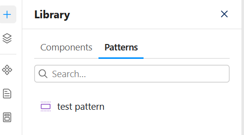
- Patterns are snapshots of a component setup (e.g., a header or a footer).
- For redesigns a new pattern needs to be added and then changed on all the pages.
- Patterns can be added with the Add pattern link in the component menu.
Creating Frontend Components
The creation of the backend components is separated from the Canvas modules, which makes them, for me, the components you don’t want editors to mess with.
Frontend components can be created by editors who have the Administer code components permission.
When clicking on the Manage library icon you see a list similar to the one shown when clicking on the Add icon.
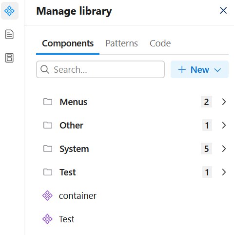
The biggest change is the addition of the New dropdown menu and the Code section.
- I’m not sure why they made New a dropdown menu, because you can only add frontend components.
- In the Code section you can see components that have been created but are not linked to the components list.
Once you click on the Code component link in the New dropdown, a popup appears asking for the component name. After you close the popup, the edit interface for the component is displayed.
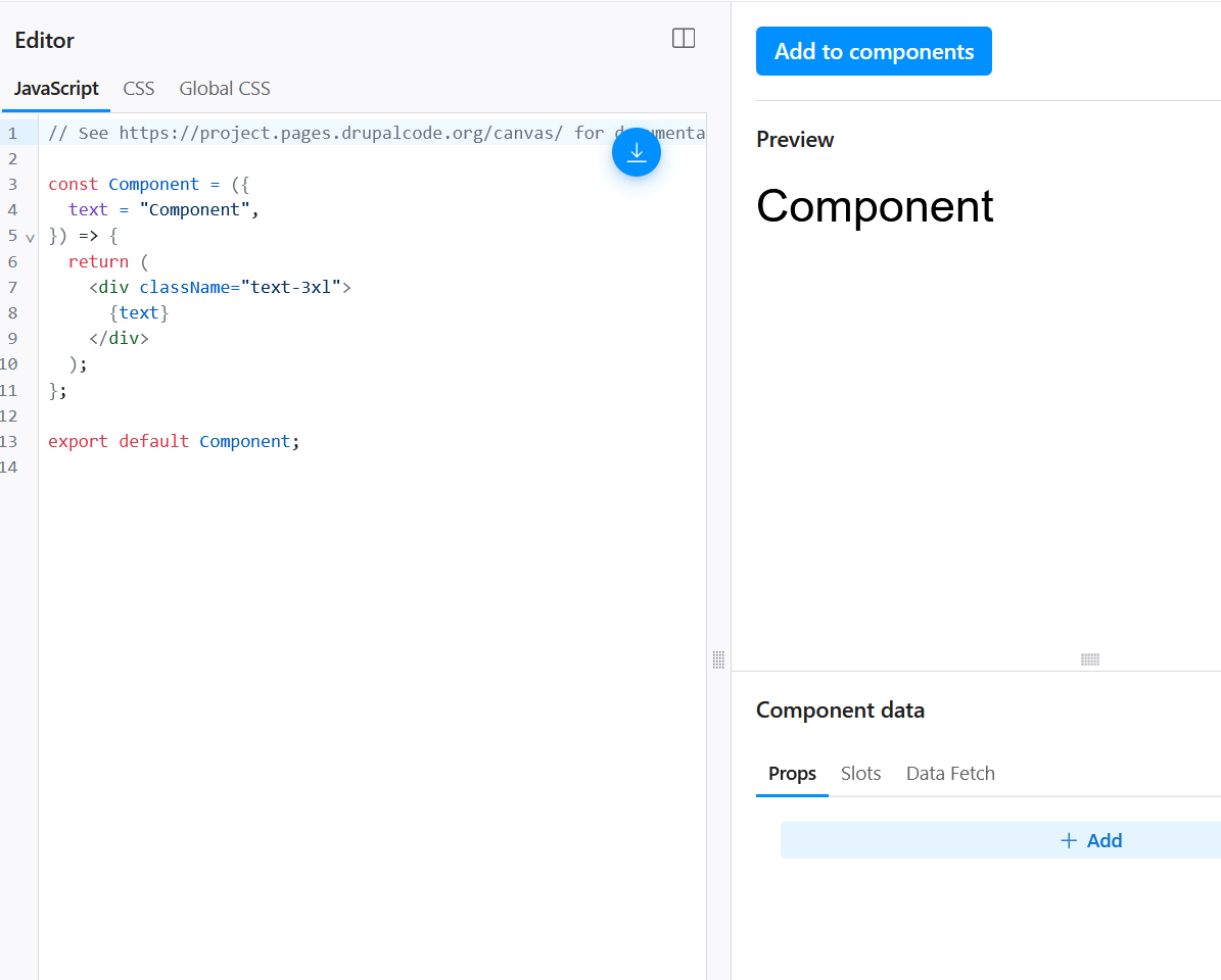
- On the top right you see the Review changes button to save the component.
- Slightly to the left and down you see the Add to components button – this is the button that allows the component to be added to pages.
After playing around with creating and changing components I noticed there are quite often errors on saving, but after saving a second time the error does not return.
Temporary Conclusion
While the components already offer a lot of functionality, the left toolbar feels confusing after using it for a while.
Having two toolbar sections that are similar, and even having similar popup menus, makes me click on the wrong icons more often. I think a Manage components button next to the navigator that opens a popup would be less confusing.
These are just teething problems, though.