可定制的“Toast-like”通知 via openCustomDialog(字体大小 & 面板大小)
发布: (2026年3月16日 GMT+8 09:28)
3 分钟阅读
原文: Dev.to
Source: Dev.to
可自定义的 “Toast‑like” 通知(通过 openCustomDialog 实现字体大小与面板尺寸)
需求描述
提供一种 Toast‑like 的短暂消息,能够自定义 字体大小 以及 面板的宽度/高度/圆角/背景,而内置的 openToast 接口并未提供这些属性。
背景知识
Toast(即时反馈):临时的反馈 UI。
指南:全局自定义对话框(UIContext):推荐使用
PromptAction.openCustomDialog来实现更丰富、全局的提示。
指南:Toast API 的局限:
UIContext.getPromptAction().openToast不支持字体大小或面板尺寸的设置。
API 参考:
实现步骤
- 使用 Builder 构建 Toast 内容(例如带自定义
fontSize、颜色、对齐方式的Text)。 - 通过
openCustomDialog打开非模态自定义对话框,传入 width/height/cornerRadius/backgroundColor。 - 使用
closeCustomDialog在短暂延时后自动关闭。- 保持 非模态 并 居中对齐,通过 offset 来模拟 Toast 的行为。
代码片段 / 配置
let customDialogId: number = 0
@Builder
function customDialogBuilder() {
Column() {
// 完全可自定义的排版与颜色
Text('Custom Toast').fontSize(20).fontColor('#fff')
}
.width('100%')
.height('100%')
.justifyContent(FlexAlign.Center)
.alignItems(HorizontalAlign.Center)
}
@Entry
@Component
struct Index {
@Builder
customDialogComponent() {
customDialogBuilder()
}
build() {
Row() {
Column() {
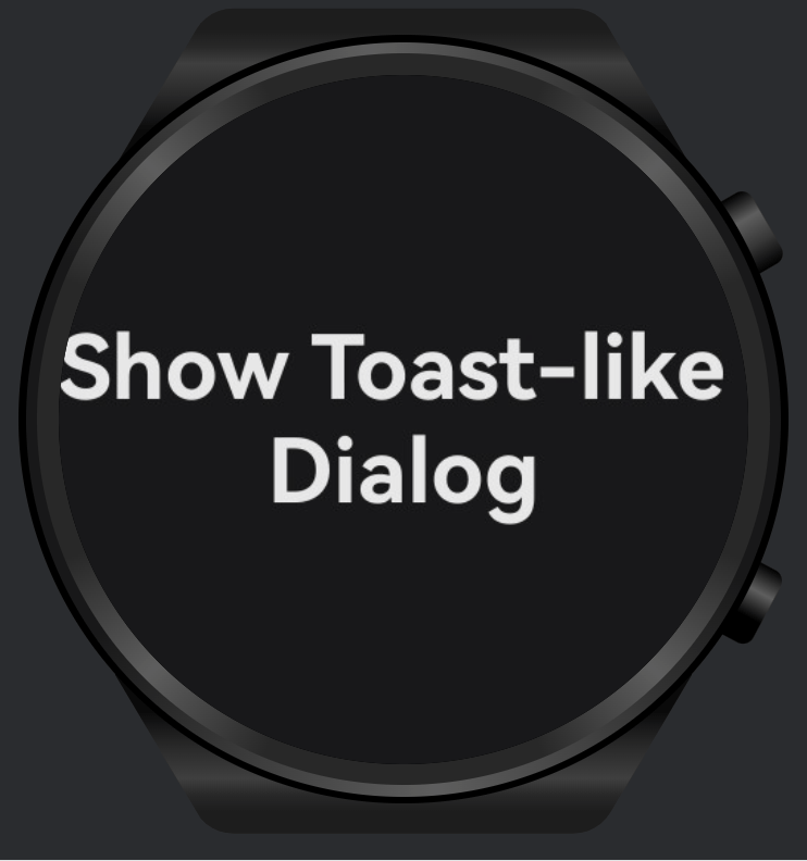
Text('Show Toast-like Dialog')
.fontSize(30)
.fontWeight(FontWeight.Bold)
.onClick(() => {
this.getUIContext().getPromptAction().openCustomDialog({
builder: () => this.customDialogComponent(),
// 可视容器控制(Toast‑like 面板)
backgroundColor: 'rgba(0,0,0,0.8)',
backgroundBlurStyle: BlurStyle.NONE,
cornerRadius: 5,
width: '50%', // 面板宽度
height: 50, // 面板高度
isModal: false, // 非模态,类似 Toast
alignment: DialogAlignment.Center,
offset: { dx: 0, dy: 100 }
}).then((dialogId: number) => {
customDialogId = dialogId
setTimeout(() => {
this.getUIContext().getPromptAction().closeCustomDialog(customDialogId)
}, 1500)
})
})
}.width('100%')
}.height('100%')
}
}测试结果
- 已验证 文字字体大小 与 面板宽度/高度/圆角/背景 均可完全控制。
- 自动关闭在约 1.5 秒后可靠触发,交互保持非阻塞(非模态)。
限制或注意事项
openToast使用更简便,但 无法自定义排版或面板尺寸;仅适用于基础消息。- 对于复杂样式或品牌化的 Toast,建议使用
openCustomDialog;同时要确保 可访问性(对比度、尺寸)。 - 需考虑 安全区 以及 设备差异(如可穿戴设备的圆形/紧凑屏幕)。
相关文档或链接
- Toast 指南:
- 全局自定义对话框指南:
PromptAction.openToastAPI: