2026 코쿠요 디자인 어워드 수상자
Source: Hacker News
코쿠요 디자인 어워드 2026 – 개요
The Kokuyo Design Awards (formerly highlighted here) are arguably Japan’s most prestigious stationery design award. Hosted by the 120‑year‑old stationery firm KOKUYO, the competition receives close to 1,500 entries each year for new products that have yet to be commercialized, with winning concepts given the opportunity to become real‑life products.
For this year’s theme—hamon: design that resonates—designers were asked to submit concepts based on their own unique, lived experience, which in turn has the potential to resonate with society. One Grand Prix winner and three Merit Awards were announced last month.
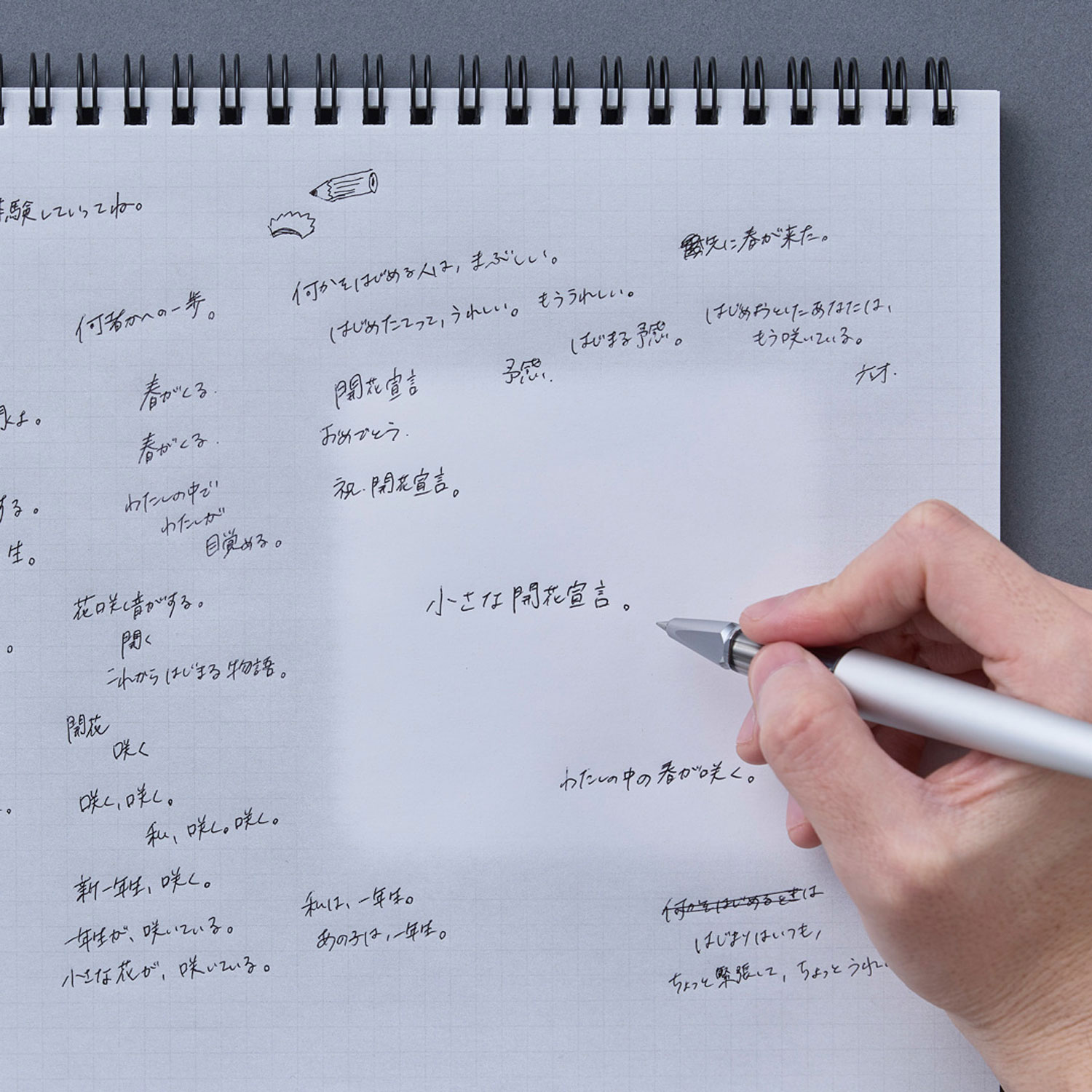
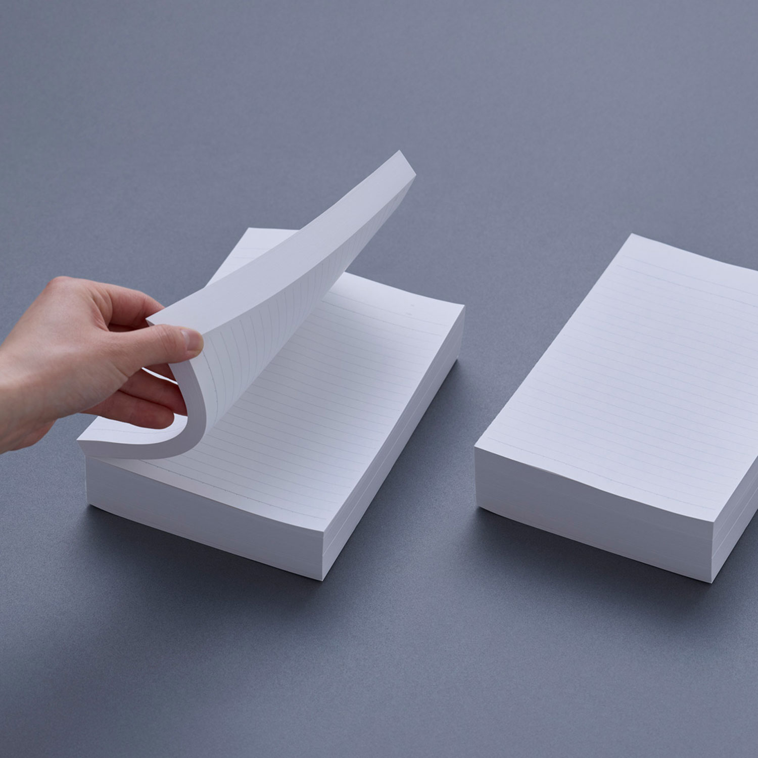
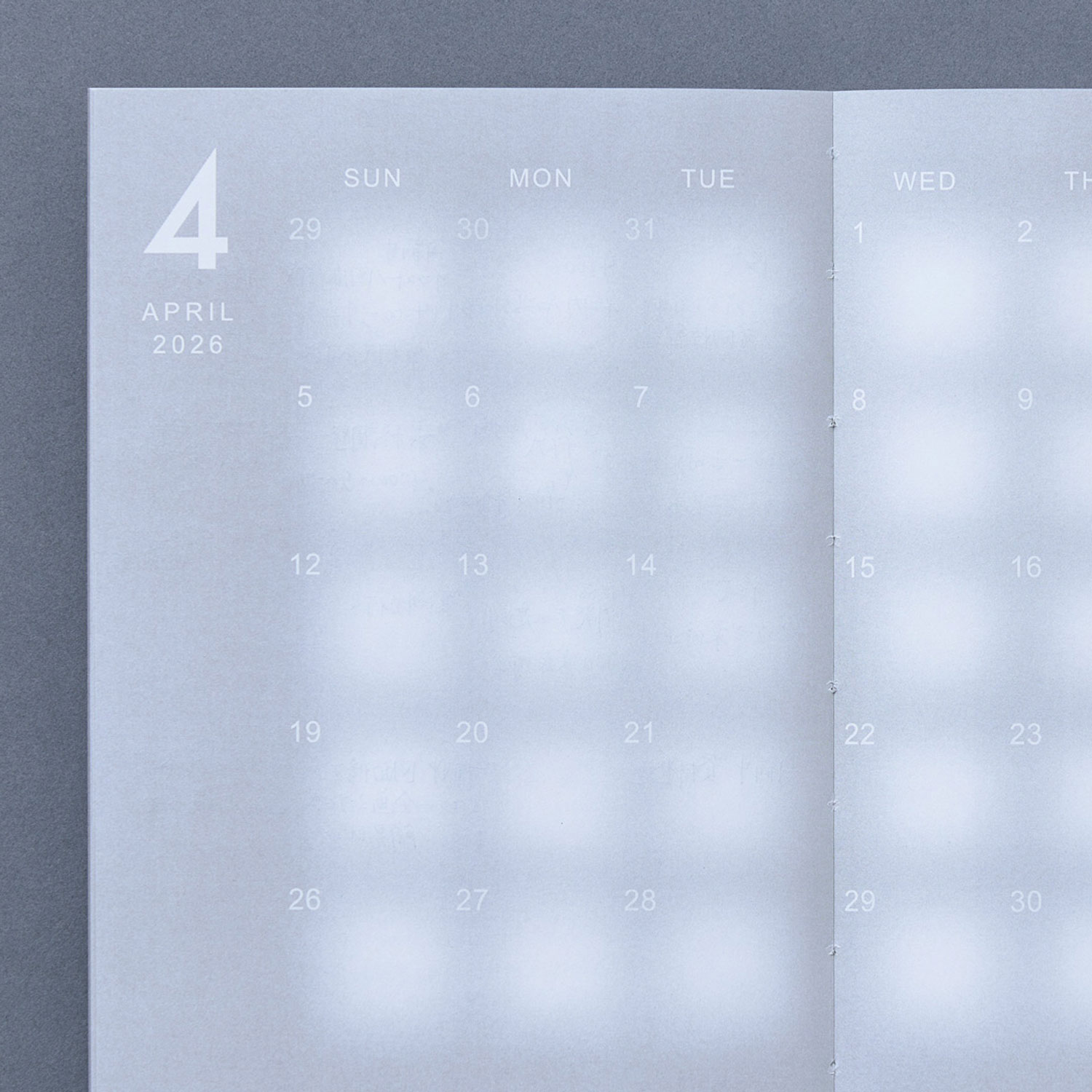
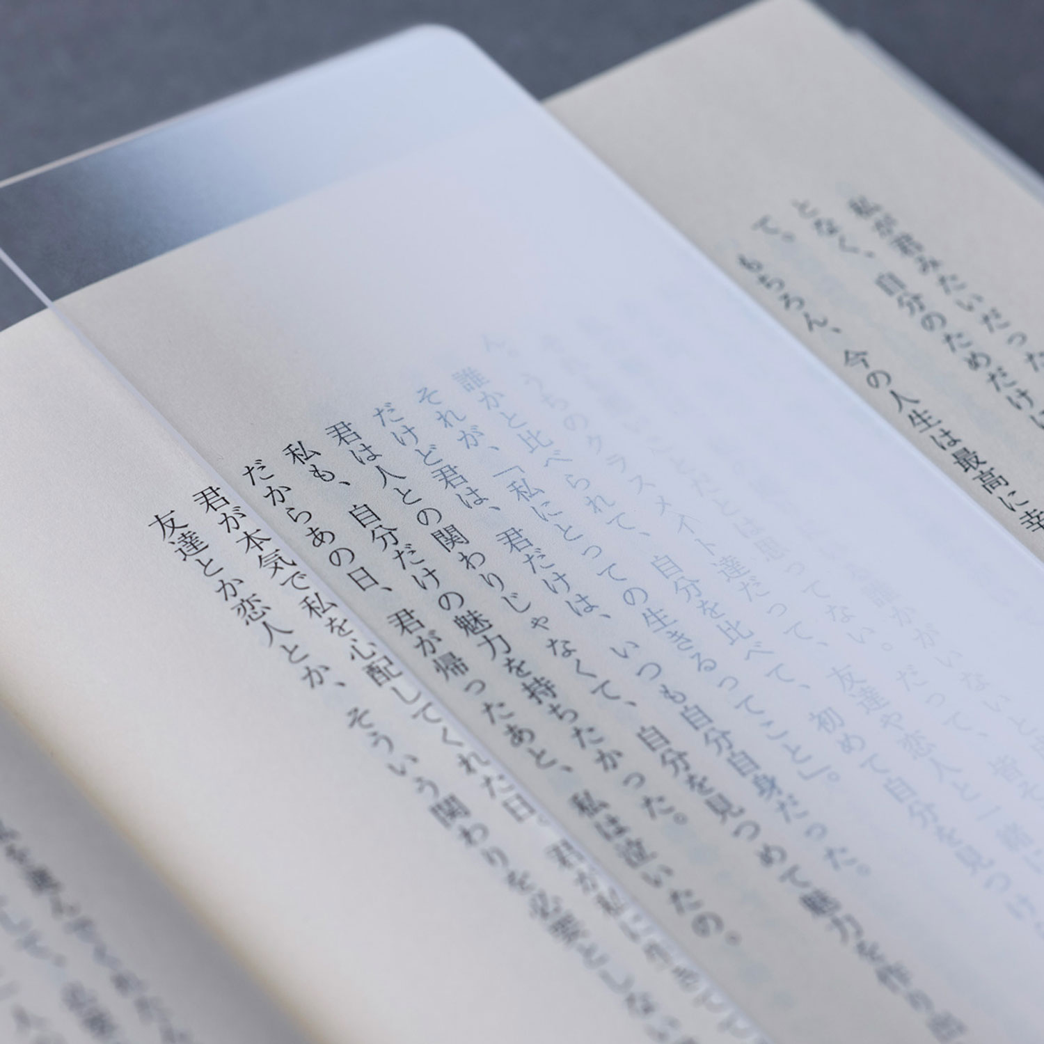
그랑프리: 히로키 칸나리의 “Before Note”
The top prize went to Before Note, a deceptively simple yet radical rethink of the notebook. Instead of a finished product, Kannari proposes a “pre‑notebook”—a bundle of pages that users can customize themselves by choosing the number of sheets and cover design.
It’s a design that sits between mass production and personalization, reflecting a world where individuality matters more than ever. Rather than buying a notebook, you complete it—turning a passive object into an active, personal process.
Merit Awards
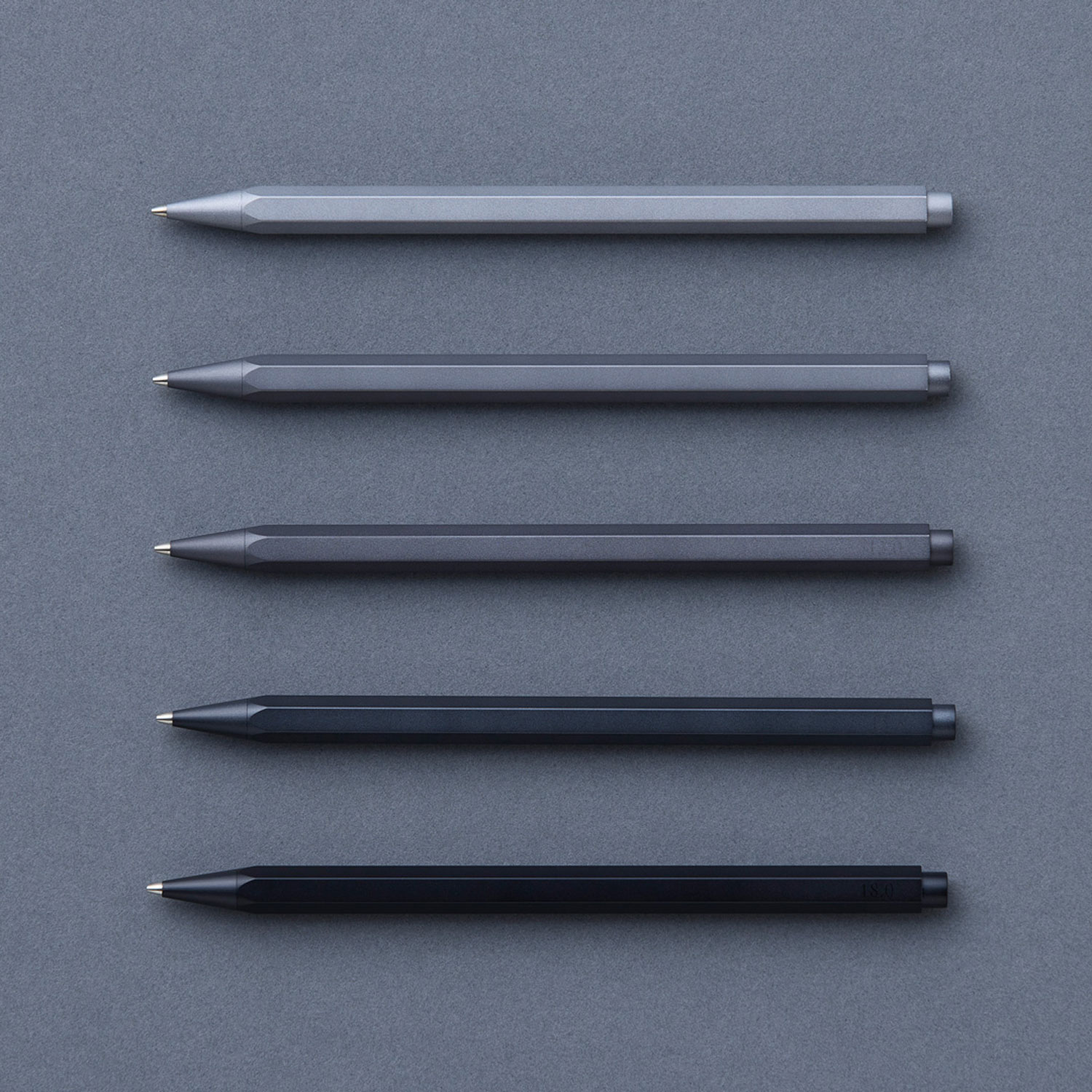
Gram by Takashi Higashide
이 펜 시리즈는 거의 보이지 않는 것, 즉 무게를 탐구합니다. 형태나 재질을 바꾸지 않고 단 몇 그램만 조정함으로써 우리의 필기 경험이 얼마나 미묘하게 변할 수 있는지를 보여줍니다.
gram의 뛰어난 점은 그 민감성에 있습니다. 사용자가 평소에 놓치기 쉬운 감각을 인식하게 하여, 필기를 보다 의식적이고 촉각적인 행위로 전환시킵니다.
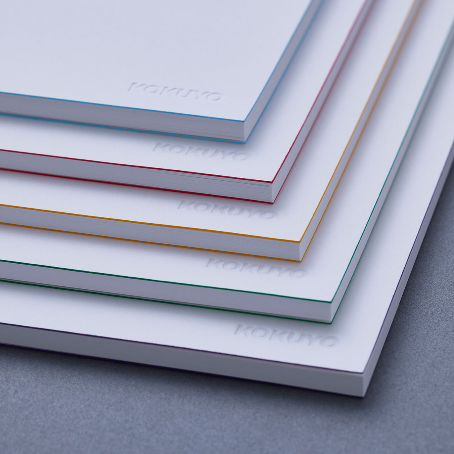
Notebooks Identified by Edges by Yuji Tsukamoto
첫눈에 이 노트북들은 최소주의적으로 보입니다—단순한 흰색 표지에 조용한 우아함이 깃들어 있죠. 핵심 디테일은 색이 입힌 가장자리이며, 이를 통해 사용자는 시각적 조화를 유지하면서도 한눈에 노트북을 구분할 수 있습니다.
조직화와 미학이 완벽하게 균형을 이룹니다. 전체 표지를 색칠하는 대신 가장자리만 색을 입힘으로써 디자인은 잉크 사용량을 은은히 줄이며, 지속 가능성에 대한 조용한 메시지를 전달합니다.
Gradience Diary by Mizuki Igarashi & Rara Takizawa
전통적인 플래너는 딱딱한 박스와 깔끔하게 구분된 날짜를 강요합니다. Gradience Diary는 그 구조를 완전히 거부합니다.
선을 대신해 부드러운 그라데이션을 사용함으로써 사용자는 일정에 따라 필기 공간을 확장하거나 축소할 수 있습니다. 작업은 날을 넘어 자연스럽게 흐르며, 시간의 실제 느낌—유동적이고, 고르지 않으며, 연속적인—을 반영합니다.
최종 후보
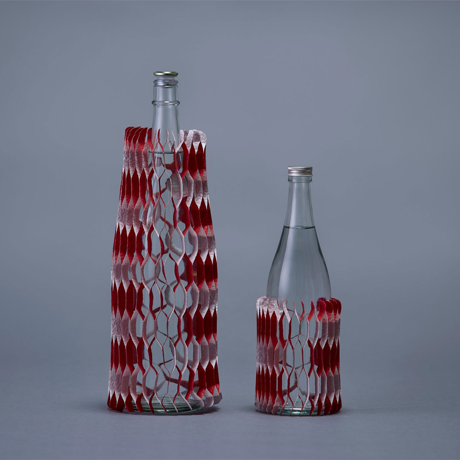
타스쿠 덴노의 레드 앤 화이트 포장지
벌집 구조의 포장재로, 장식으로 변신하여 선물 포장의 수명을 연장합니다.
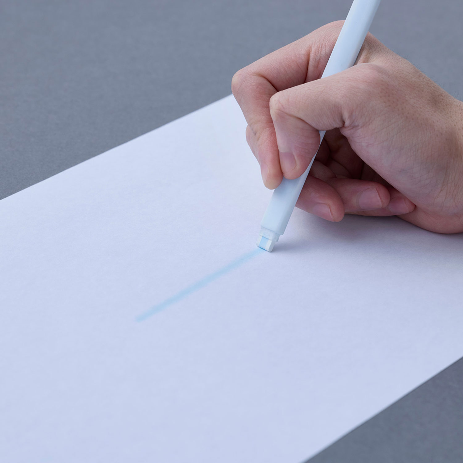
Ryoichi Nakamura의 AWAI
희미하고 번진 선을 그리는 펜으로, 대담한 확신보다 모호함과 성찰을 유도합니다.
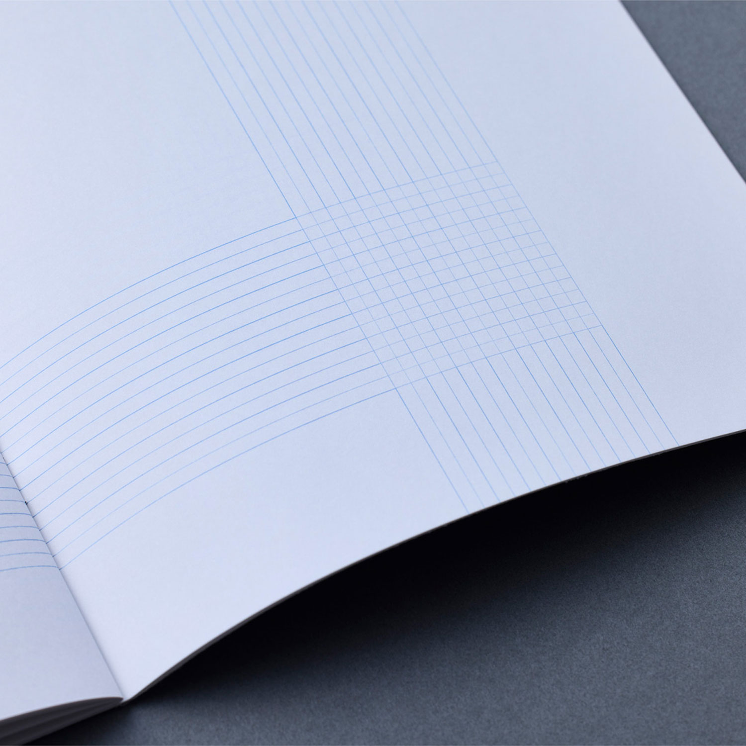
Yohei Oki의 OVERLAP
교차하는 선과 빈 공간을 활용한 노트북 디자인으로, 새로운 사고와 글쓰기 방식을 촉진합니다.
Yoshihiro Matsumura의 KASUMIORI
kasumi (안개)에서 영감을 받은 KASUMIORI는 안개를 통해 보는 듯한 깊이와 모호함을 만들어내는 독서 가이드 및 북마크로, 독서를 보다 분위기 있고 성찰적인 경험으로 바꿔줍니다.
Nao Momoishi의 a glimmer of inspiration
카피라이터가 만든 이 펜은 미묘한 스포트라이트를 비추어 사용자가 갑작스러운 영감의 순간을 빠르게 기록하도록 설계되었습니다.