Why TUIs Are Back
Source: Hacker News
Overview
DHH’s Omarchy is made of three types of user interfaces:
- TUIs – for immediate feedback and bonus geek points
- Webapps – because 37signals (his company) sells SaaS web applications
- Native applications – the unavoidable GNOME‑style apps that don’t fit well in the distro’s style
The same pattern occurred about ten years ago in code editors. We moved from native editors such as BBEdit, TextMate (also promoted by DHH), Notepad++ and Sublime to Electron‑powered apps like Atom, VS Code and all their forks. The hardcore migrated to Vim or Emacs, trading immediate feedback and higher usability for the steepest learning curve I’ve ever seen.
Windows
The lesson is clear: native applications are losing. Windows is doing the GUI‑library‑standard joke—when one API fails, they make up another, only for it to fail amid the sea of alternatives that exist.
- MFC (1992) wrapped Win32 in C++. If Win32 was inelegant, MFC was Win32 wearing a tuxedo made of other tuxedos.
- Then came OLE, COM, ActiveX. None of these were really GUI frameworks—they were component architectures—but they infected every corner of Windows development and introduced a level of cognitive complexity that makes Kierkegaard read like Hemingway.
“— Jeffrey Snover, in Microsoft hasn’t had a coherent GUI strategy since Petzold”
Since then, Microsoft has cycled through WinForms, WPF, Silverlight, WinUI, MAUI without lasting success. Many enterprise and personal desktop applications still rely on Electron, and the last memory of coherent visual integration of the whole OS I have is of Windows 98 or 2000.
“— Domenic Denicola, in Windows Native App Development Is a Mess*”
Recreating an OS’s UI APIs every few years is a lot of work. Coupled with intermittent attempts at sandboxing and deprecating “too powerful” functionality, each new layer leaves gaps where you can’t do things that were possible in the previous framework.
Linux
The UI inconsistency in Linux was created by design. Different teams wanted different outcomes and had the freedom to implement them. GTK and Qt became the two reigning frameworks. While Qt is the more famous, both aim to support cross‑platform native development (once upon a time I successfully compiled gedit on Windows, learning a lot about C compilation, makefiles, and environment variables in the process) but are primarily used on Linux.
Luckily, applications built with different toolkits can look “okay‑ish” next to each other—something the disparate Windows frameworks fail to achieve. How many engineer‑hours does it take to redo the Windows Control Panel?
Given the difficulty of testing the millions of combinations of distros, desktop environments, and hardware, most companies avoid native Linux applications. They either ship Electron apps (minting the lock‑down) or let the open‑source community solve the problem themselves (when open APIs exist).
macOS
Apple used to be a one‑book religion. Apple’s Human Interface Guidelines were cited in every UI course worldwide. Xerox PARC and Apple were the two institutions that studied what it means to have a good human interface. Fast forward a few decades, and Apple is doing its best worst to break all the guidelines and consistency it was once known for.

Now, Apple has been:
- Ignoring Fitts’ law (Hacker News discussion)
- Making window resizing near‑impossible (January 2026 post, February 2026 follow‑up)
- Adding icons to every single menu (Tonsky’s blog)
macOS is no longer the safe haven where designers can work peacefully.
Electron
Everyone knows the user experience of Electron apps sucks. The most common complaint is memory consumption, which has been decreasing over the last decade. My main gripe (as someone who drives a 64 GB RAM MacBook Pro) is the lack of visual consistency and keyboard‑driven workflows.
Looking at my Dock, I have eight native apps (TextMate and macOS system utilities) and six Electron apps (Slack, Discord, Mattermost, VS Code, Cursor, Plex AMP). And that’s from someone who really wishes he could avoid any Electron app at all.
Take Cursor (the same applies to VS Code). If you’re in the agent panel requesting your next feature, can you move to the agent list on the side panel with just the keyboard? Can you archive it? These actions should be the same across every macOS application, yet even when shortcuts exist they are not announced in the menus. Over the past decade, developers have been forgetting to add menus for actions that are already available in their HTML‑based sandboxed UI. For the record, Slack does this better than the others, but it’s still not perfect.
Restarting from Scratch
Together with Dart, Google wanted to design a new operating system—without the legacy of Android—for new devices. It aimed for a fresh UI toolkit (Flutter UI), but Google abandoned the project before a real product launched. It’s one of those situations where a promising clean‑slate effort never got off the ground.
Monopoly and Market Share
Having a monopoly (or a large enough slice of the market) is required to succeed.
Meanwhile, Zed did the same thing in Rust: they designed their own GPU‑renderer library (GPUI) which is cross‑platform. Despite the high speed, it lacks integration with the host OS, requiring developers to add the right bindings. Personally, I would rather have a slower renderer that integrates with my OS than the extra speed.
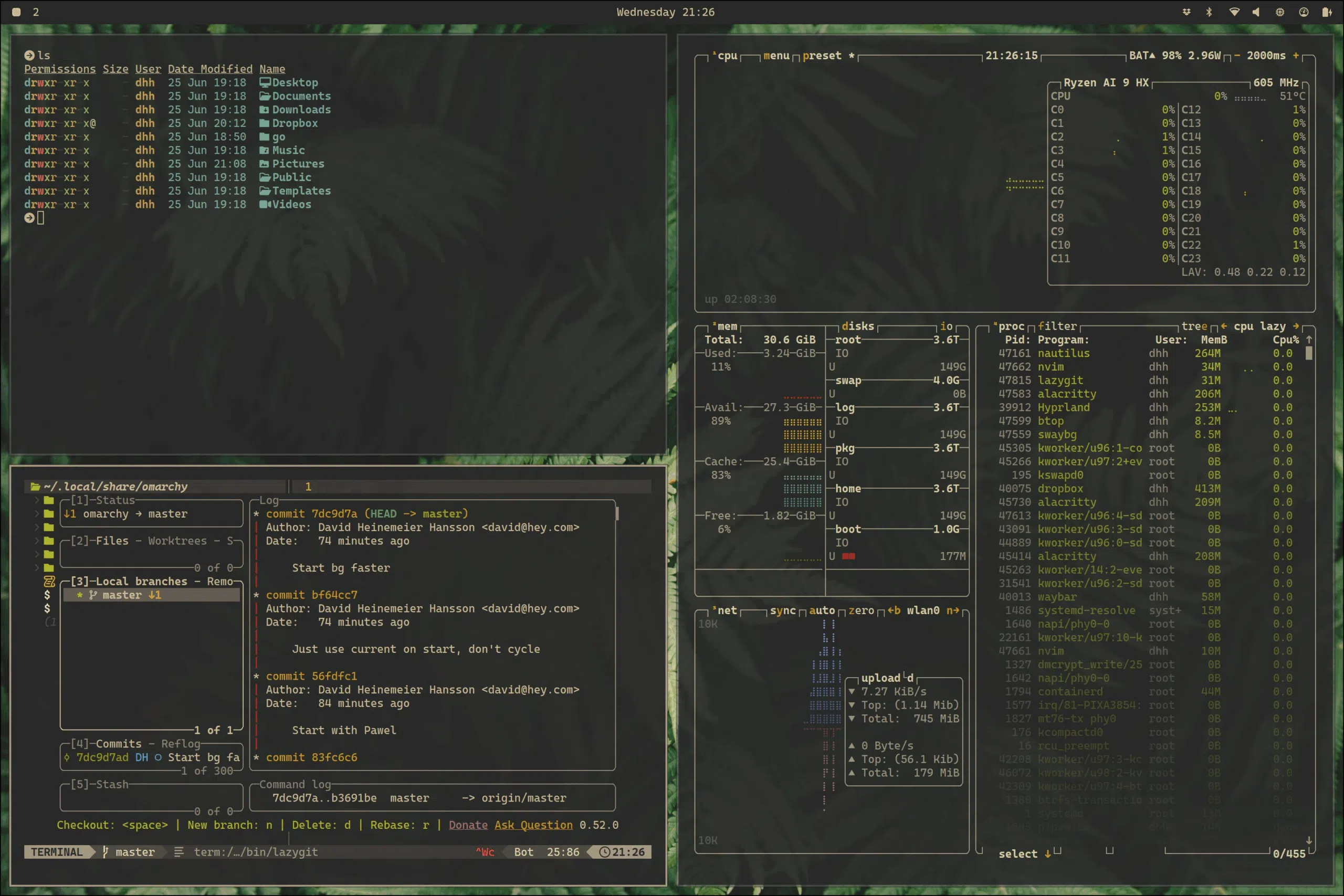
TUIs
TUIs are fast, easy to automate (RIP Automator) and work reasonably well on different operating systems. You can even run them remotely without any headache‑inducing X forwarding.
When native UI toolkits fail, we go back to basics. Claude and Codex have been very successful on the command line: you focus on the interaction and forget about the operating system around you. You can even drive code and apps on cloud machines, or remote into your GPU‑powered machine from your iPad.
TUIs are filling the void left by Apple and Microsoft in the post‑apocalyptic world where every application looks different. This is good if you are doing art (including computer games), but not if your goal is to get out of the way and let the user do their job.
What’s Next
A checkbox is also part of an interface. You use it to interact with a system by inputting data. Interfaces are better the less thinking they require: whether the interface is a steering wheel or an online form, if you have to spend any amount of time figuring out how to use it, that’s bad.
As you interact with many things, you want homogeneous interfaces that give you consistent experiences. If you learn that Command + C is the keyboard shortcut for copy, you want that to work everywhere. You don’t want to have to remember to use Ctrl + Shift + C in certain circumstances or right‑click → Copy in others—that would be annoying.
We need to go back to the basics. Every developer should learn the theory of what makes a good user interface (software or not!), such as the works of Nielsen, Norman, or Johnson:
- Nielsen – Usability Engineering
- Norman – The Design of Everyday Things
- Johnson – Designing with the Mind in Mind
Stop treating user design as a soft skill that does not matter in the software engineering curriculum. In any course, if the UI does not make sense, the project should fail. In HCI courses, we should aim for perfect UIs. It takes work, but that work is mostly about understanding what we need; the programming is already being automated.
Operating system and toolkit authors should drive this investment. They should focus on making accessible toolkits that developers want to use, lowering the barrier to entry, and making those platforms last as long as possible. I do not necessarily argue for cross‑platform support, but having one such solution would help reduce the Electron and TUI dependency.