The day I discovered type design
Source: Hacker News
Early Years
Fifty years ago this month, March 1976, at 20 years old, my interest in type design began.
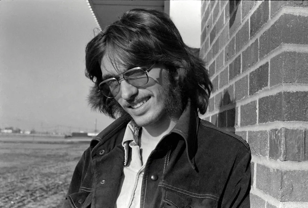
I was in my second year of a two‑year commercial art program at North Hennepin Community College (NHCC), a northern suburb of Minneapolis. At first I was thinking of pursuing a career as an illustrator, but I was also interested in graphic design. In addition to these, I studied art history, drawing and painting, lettering, printmaking, as well as writing and other liberal arts classes.
College Lettering Project
What sparked my interest in type design was a project in the advanced lettering class taught by Lance Kiland (who I kept in touch with until his untimely passing in 2013). We mostly learned to do lettering with brushes and Speedball pens. At the time, lettering was considered a basic skill for a graphic designer—necessary for marker layouts used to sell a design to a client before it was set in actual type, which was very expensive. This was a decade before desktop publishing would allow anyone to set their own type on a personal computer and turn the business of typesetting upside down.
I had been working with type and doing lettering since high school, as editor and designer of the school newspaper and yearbook. Frustrated with the limited methods we had to set headlines, I started purchasing rub‑down type on my own. I fell in love with type from looking at Chartpak and Letraset catalogs, and developed a taste for typography under the influence of my uncle Knut, a graphic designer in Chicago.
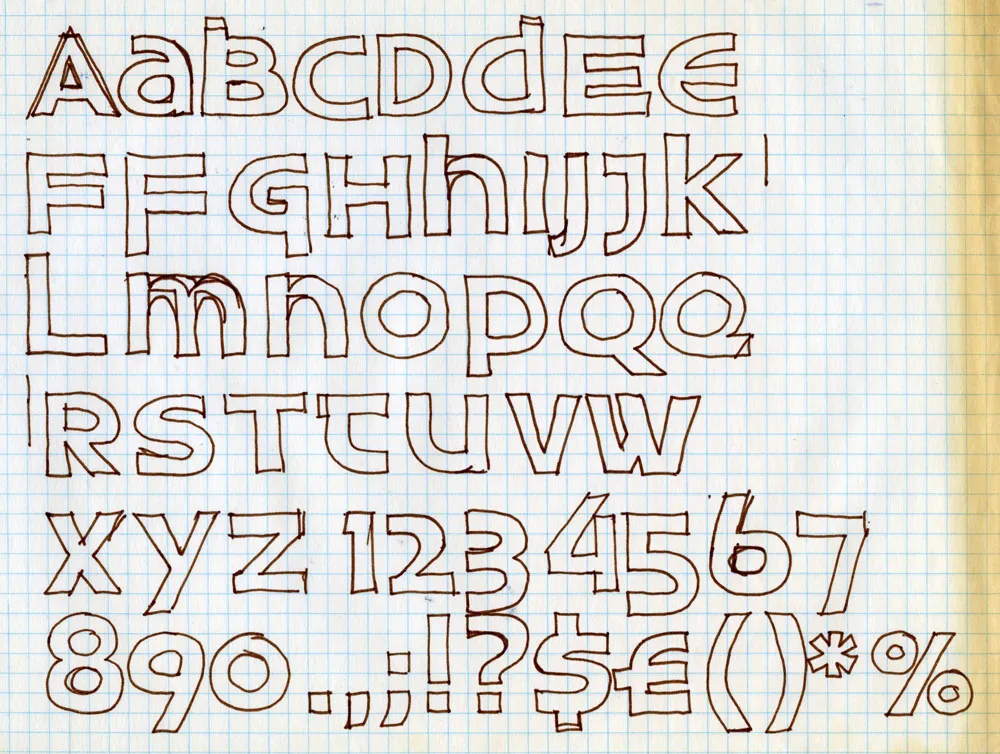
The final project in my college lettering class was to design a complete, original alphabet—a typeface.
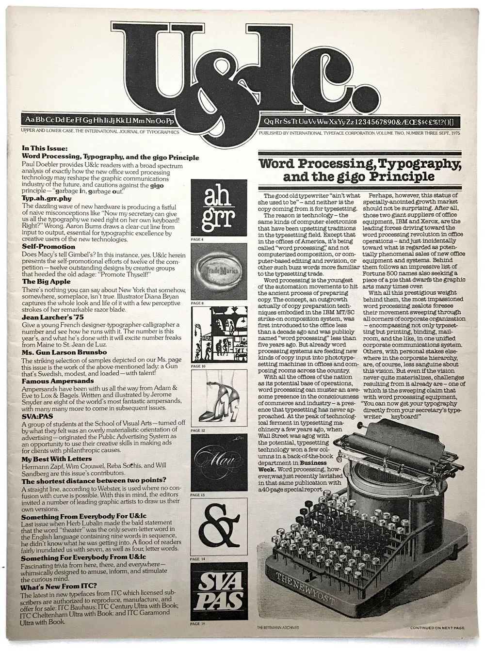
Discovery of U&lc Magazine
By coincidence, I discovered a copy of U&lc magazine in the graphics classroom. U&lc was published by the International Typeface Corporation (ITC), and its designer/editor was the legendary Herb Lubalin. I’d never seen such beautiful typography and design—it was a motherlode for an aspiring typophile like me.
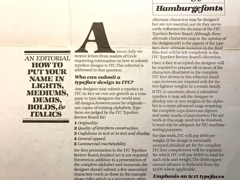
ITC typefaces were available on virtually every typesetting machine and alphabet product, such as Letraset. In U&lc I spotted a call for typeface submissions; if accepted, ITC would pay an advance plus royalties. Lance told me he’d heard of a designer in Minneapolis who had made over $50,000 on a typeface design that got published (almost $290 K in 2026 dollars).
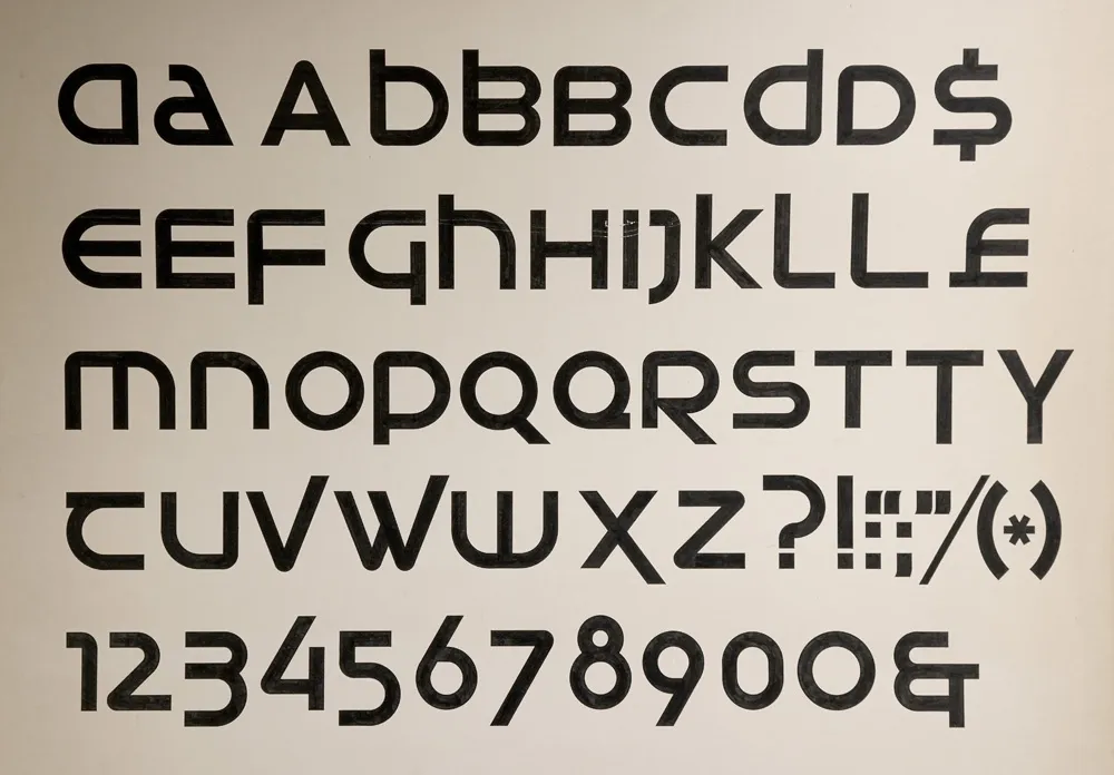
Designing Uncial Sans
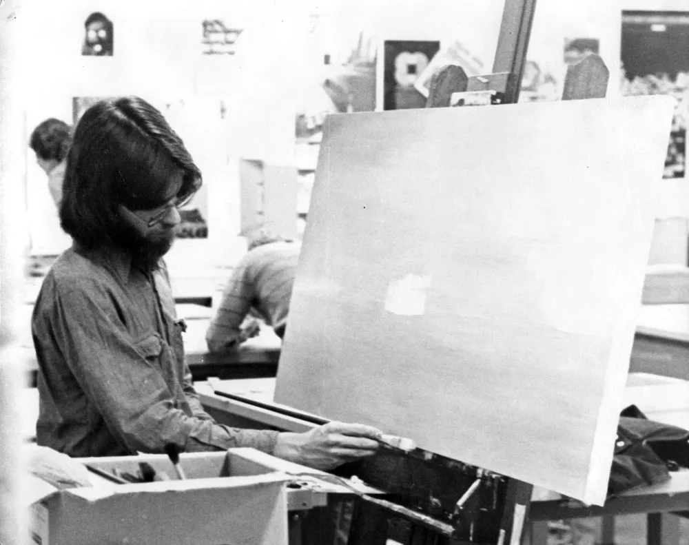
All of this was on my mind as I worked on the assignment. I came up with the idea of a very modern, geometric sans‑serif design based on the underlying forms of uncial calligraphy. I drafted the artwork on a large sheet of illustration board, with 2.5‑inch‑tall letters drawn by hand in ink using Rapid‑o‑Graph technical pens, a T‑square, circle templates, and other drawing tools.
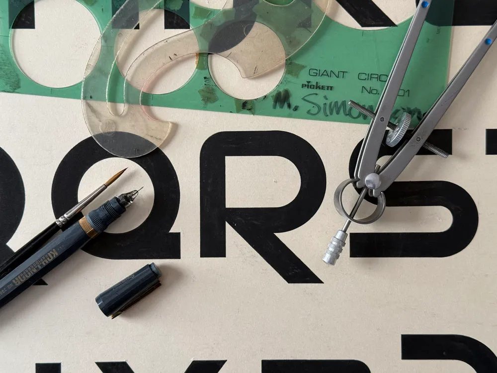
A close‑up of the finished artwork shows some of the tools I used: circle templates, French curve, Rapid‑O‑Graph pen, brush, and compass.
Designing a typeface was very exciting. The idea of creating an original alphabet fired my imagination, and learning that it was possible to design type professionally was a revelation. I decided right then that someday, somehow, I wanted to design typefaces. From that day on, even though I pursued other work over the coming decades (graphic design, art direction, some illustration), type design was always in the back of my mind, and I frequently sketched ideas for new typefaces.
Later Reflections
It wasn’t until almost twenty years later, in the mid‑1990s, that I finally got a typeface published. Looking back, that lettering assignment in 1976 was where it all started.