Tableau Portfolio Project: Designing an Interactive COVID-19 Dashboard
Source: Dev.to
Tableau Portfolio Project
This Tableau portfolio project began as a personal exploration and quickly evolved into a deep dive into dashboard design, interactivity, and data‑visualisation best practices. It demonstrates my ability to create dashboards that are intuitive for multiple user types—executives, middle management, and general users—while showcasing advanced Tableau techniques.
Exploring COVID‑19 Data with Tableau
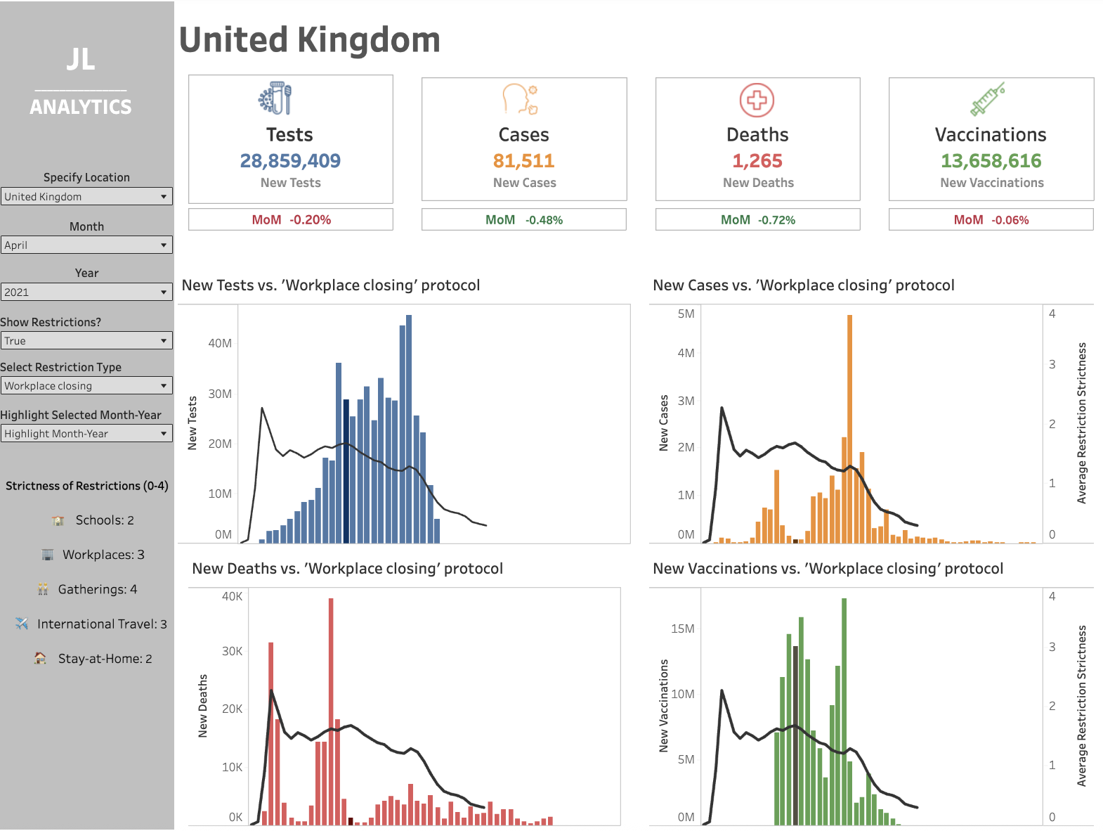
I chose COVID‑19 data that includes cases, tests, deaths, vaccinations, and government‑restriction metrics. My goal was to create a Tableau KPI dashboard that allows users to explore trends, compare metrics, and gain actionable insights.
Currently, the project features one interactive dashboard, with plans to expand to additional views to showcase further Tableau analytics capabilities.
Key Tableau Techniques Used
- Parameters and Calculations – Dynamically adjust month‑year selection and highlight corresponding bars.
- Interactive Highlights – Toggle government‑restriction line on/off.
- Conditional Formatting – Month‑over‑month (MoM) values colour‑coded green/red.
- Symbols and Visual Cues – Icons for cases, tests, deaths, and vaccinations.
Interactive Graph Features: Deep Dives
This section explores the five ways a user can interact with the main bar graphs, illustrating both technical implementation and user benefits.
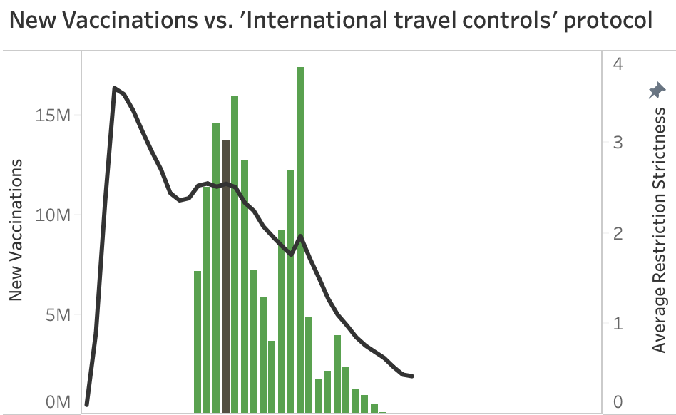
Graph 1 – Bar & Line with Highlighted Month‑Year (International Travel Controls)
- Useful for users who want to deep‑dive into both regulation and KPI data over time and check for trends.
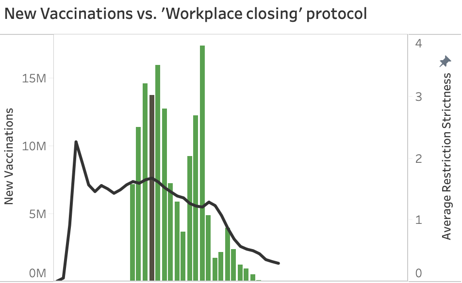
Graph 2 – Bar & Line with Highlighted Month‑Year (Workplace Closing)
- Similar to Graph 1, but compares to a different restriction type.
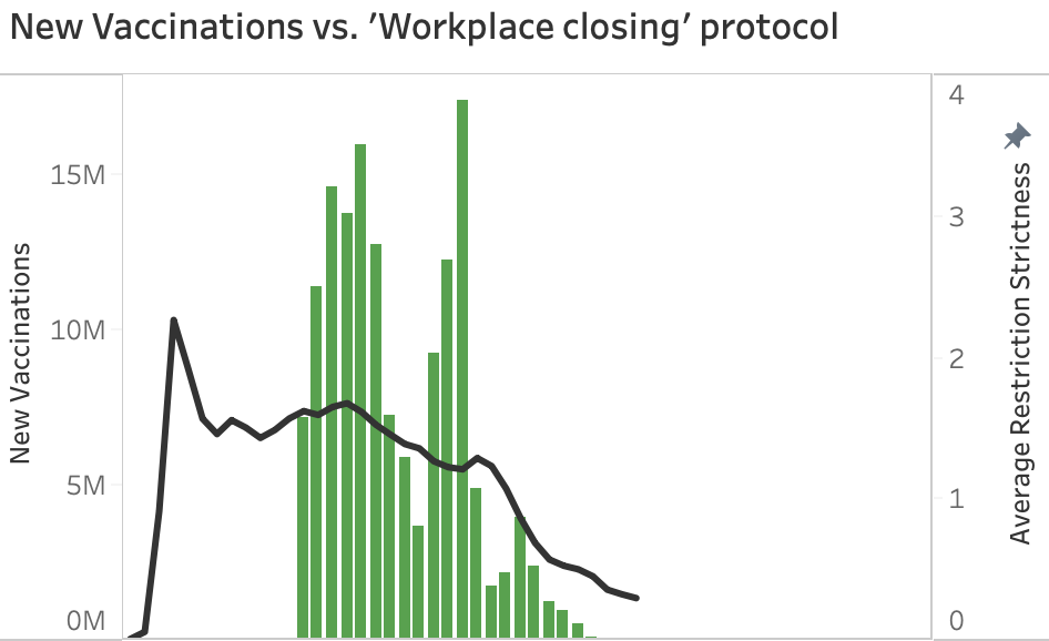
Graph 3 – Bar & Line without Highlighted Month‑Year (Workplace Closing)
- For users who aren’t interested in highlighting a specific bar.
- Helpful for screenshotting/reporting, as the highlight can cause confusion.
- Users can toggle the highlighted bar on/off via the filters on the left of the dashboard.
- Designed for executive reporting where the focus is on overall trends rather than a specific month.
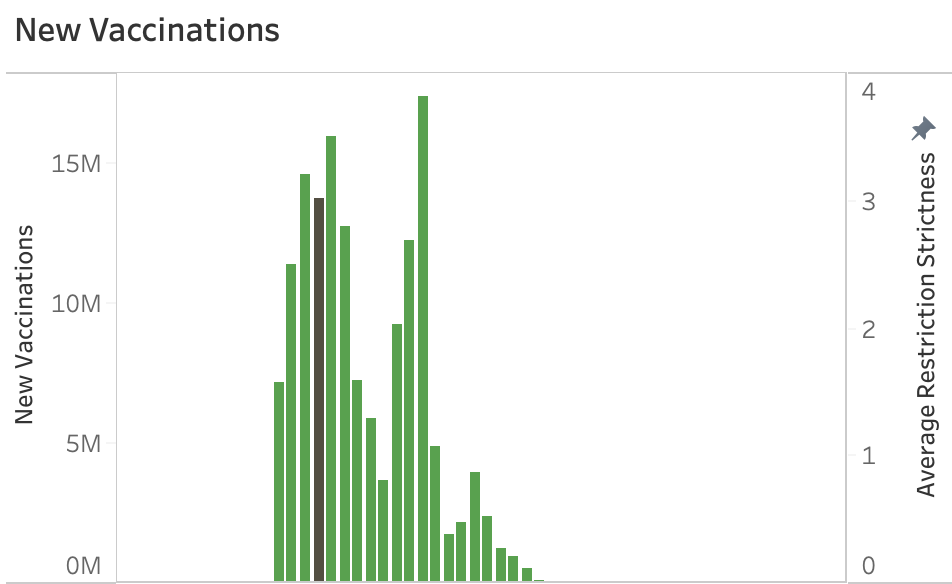
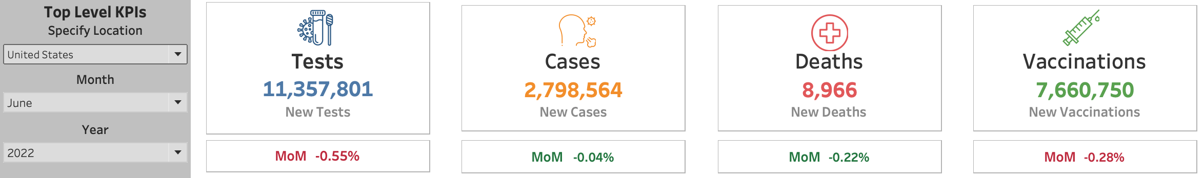
Graph 4 – Bar Graph with Highlighted Month‑Year
- For users who are not focusing on the correlation between KPIs and government regulations.
- Useful for looking at top‑level KPIs and their trend over time.
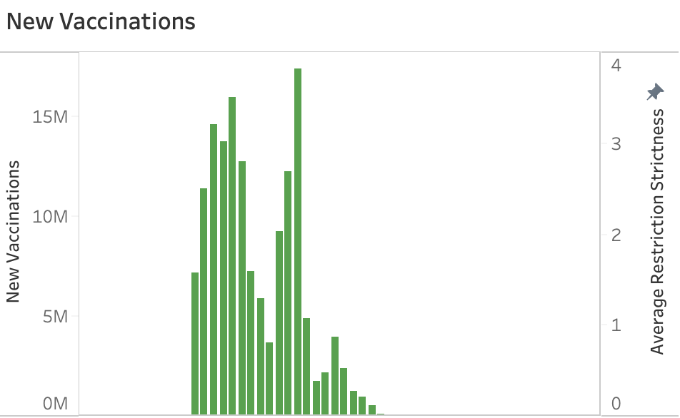
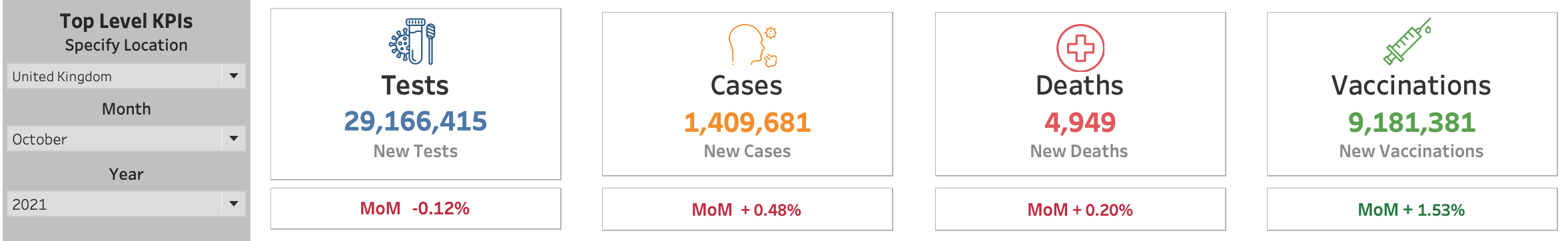
Graph 5 – Bar Graph without Highlighted Month‑Year
- The simplest view, purely showing KPI trends over time.
- May be useful in high‑level reporting.
Designing for Multiple Audiences
This dashboard balances the needs of execut (content truncated).
Audience Overview
- Executives – Quick access to KPIs and trends that can be used in documentation or slides for senior‑leadership discussions.
- Middle Management – Ability to explore deeper correlations.
- General Users – Clear symbols and interactive toggles.
The layout, hierarchy, and interactivity were carefully designed to make the dashboard intuitive and actionable.
Tableau Best Practices Applied
- Use interactivity intentionally.
- Prioritise layout and spacing.
- Apply color and symbols meaningfully.
- Highlight high‑impact metrics while allowing exploration.
- Provide conscious labelling to ensure long‑term understandability.
Explore the Dashboard
You can interact with the Tableau COVID‑19 dashboard here.
Key Takeaways
- Demonstrates Tableau dashboard design that balances usability with advanced interactivity.
- Provides a KPI dashboard suitable for multiple audiences.
- Utilises parameters, toggles, and conditional formatting for rich interactivity.
- Shows a commitment to continuous improvement with plans for future dashboards.
- Ensures long‑term usage by focusing on accurate labelling and employing calculated fields and parameters in ways that enhance—not confuse—the dashboard.