Show HN submissions tripled and now mostly share the same vibe-coded look
Source: Hacker News
When browsing Hacker News, I noticed that many Show HN projects now have a generic sterile feeling that tells me they are purely AI‑generated. Initially I couldn’t tell what it was exactly, so I wondered if we could automatically quantify this subjective feeling by scoring 500 Show HN pages for AI design patterns.
Claude Code has led to a large increase in Show HN projects—so much that the moderators of HN had to restrict Show HN submissions for new accounts.
Here is how the Show HN submissions increased over the last few years:

That should give us plenty of pages to score for AI design patterns.
AI design patterns
A designer recently told me that “colored left borders are almost as reliable a sign of AI‑generated design as em‑dashes for text”, so I started to notice them on many pages. After asking other designers, the common AI patterns can be roughly grouped into fonts, colors, layout quirks, and CSS patterns.
Fonts
- Inter used for everything, especially the centered hero headlines
- LLMs tend to use certain font combos like Space Grotesk, Instrument Serif, and Geist
- Serif italic for one accent word in an otherwise‑Inter hero
Colors
- “VibeCode Purple”
- Perma dark mode with medium‑grey body text and all‑caps section labels
- Barely passing body‑text contrast in dark themes
- Gradient everything
- Large colored glows and colored box‑shadows
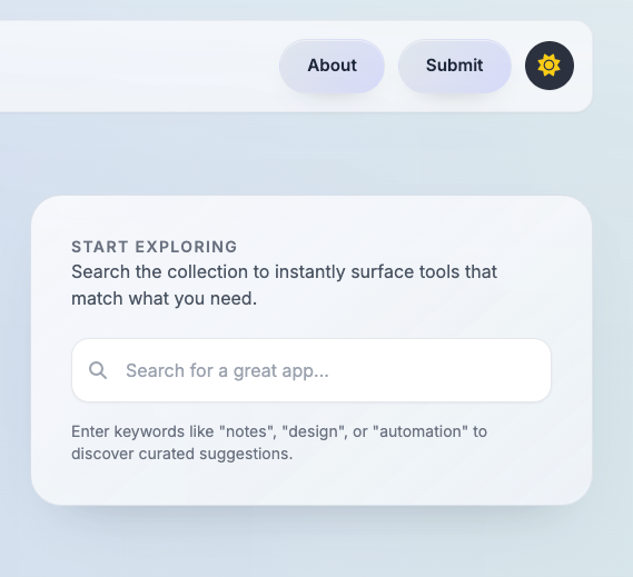
Layout quirks
- Centered hero set in a generic sans
- Badge right above the hero H1
- Colored borders on cards, on the top or left edge
- Identical feature cards, each with an icon on top
- Numbered “1, 2, 3” step sequences
- Stat banner rows
- Sidebar or nav with emoji icons
- All‑caps headings and section labels
CSS patterns
shadcn/ui- Glassmorphism
Example screenshots
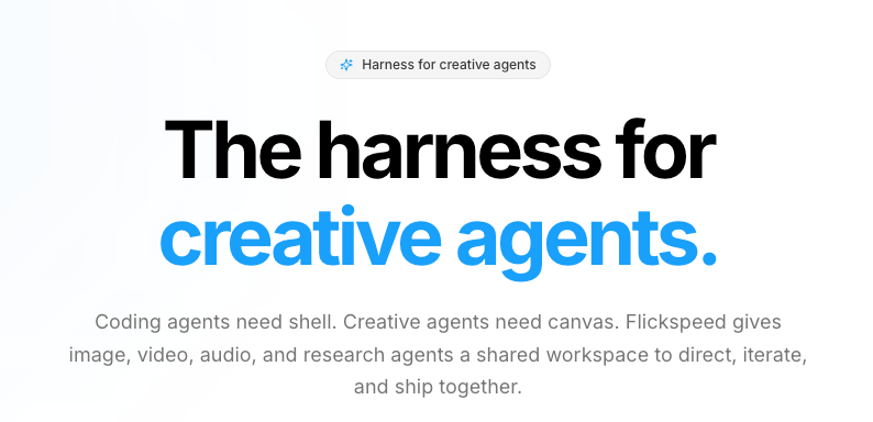
Badge above the Inter hero.
Same, different page.
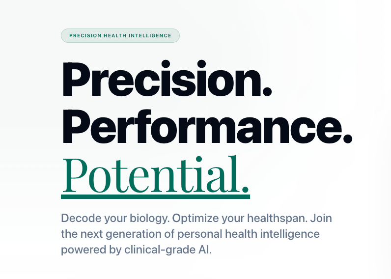
Colored border on top.
![]()
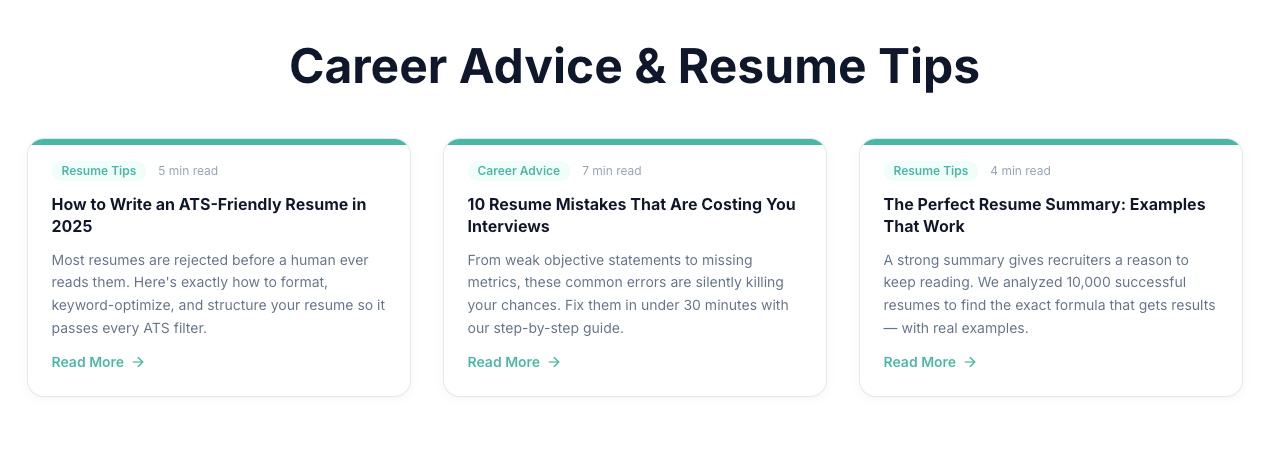
Icon‑topped feature card.
Gradient background + glassmorphism cards.
Detecting AI design in Show HN submissions
To systematically score for these patterns, I processed 500 of the latest Show HN submissions and evaluated their landing pages against the list above.
Scoring method
- A headless browser loads each site (Playwright).
- A small in‑page script analyzes the DOM and reads computed styles.
- Every pattern is a deterministic CSS or DOM check; no screenshots are taken, and the LLM does not judge them.
This approach inevitably yields false positives, but manual QA suggests an error rate of roughly 5–10 %.
If there is interest in open‑sourcing the scoring code to replicate (or improve) the run, let me know.
Results
A single pattern doesn’t necessarily make a site AI‑generated, so the sites were grouped into three tiers based on how many of the 15 patterns they trigger:
- Heavy slop (5 + patterns) – 105 sites – 21 %
- Mild (2–4 patterns) – 230 sites – 46 %
- Clean (0–1 pattern) – 165 sites – 33 %
Is this bad? Not really—just uninspired. Validating a business idea has never been about fancy design, and before the AI era everything looked like Bootstrap. There is a difference between crafting your own design and shipping with whatever defaults an LLM outputs, just as there was pre‑LLM when using CSS/HTML templates.
I guess people will eventually return to crafting beautiful designs to stand out from the slop. On the other hand, it remains unclear how much design will matter once AI agents become the primary users of the web.
This post is human‑written; the scoring and analysis were AI‑assisted.