Icons in Menus Everywhere – Send Help
Source: Hacker News
Overview
I’ve never liked the philosophy of “put an icon in every menu item by default”.
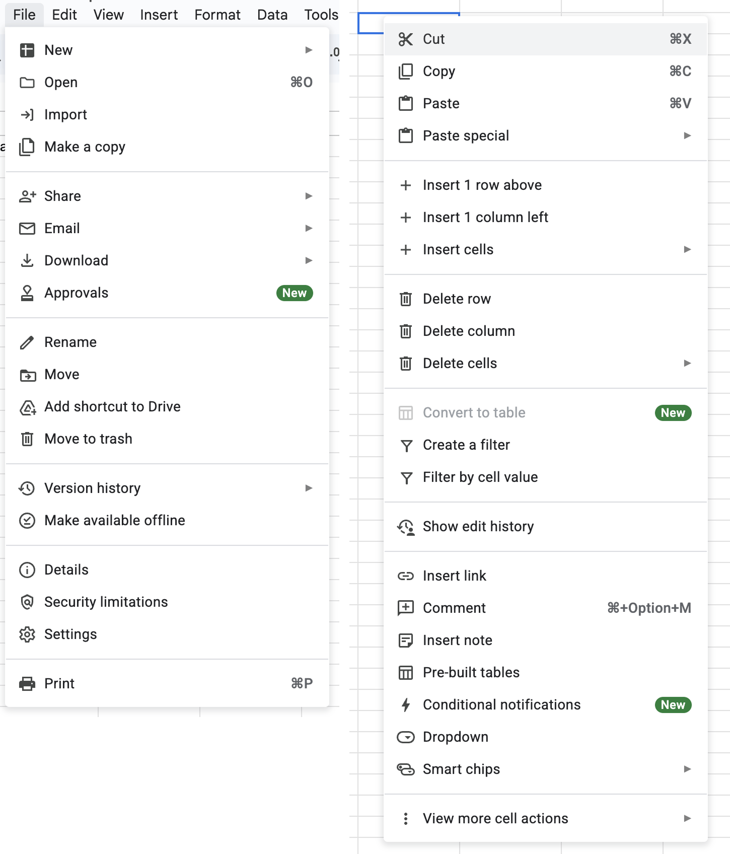
Google Sheets, for example, does this. Go to File, Edit, or View and you’ll see a menu with a list of options, every single one having an icon (same thing with the right‑click context menu).
It’s extra noise to me. It’s not that I think menu items should never have icons—they can be incredibly useful (more on that below). It’s more that I don’t like the idea of “give each menu item an icon” being the default approach.
This posture lends itself to a practice where designers have an attitude of “I need an icon to fill up this space” instead of an attitude of “Does the addition of an icon here, and the cognitive load of parsing and understanding it, help or hurt how someone would use this menu system?”
The former doesn’t require thinking. It’s just templating— they all have icons, so we need to put something there. The latter requires care and thoughtfulness for each use case and its context.
To defend my point, one of the examples I always point to is macOS. For the longest time, Apple’s OS‑level menus seemed to avoid this default approach of sticking icons in every menu item. That is, until macOS Tahoe shipped.
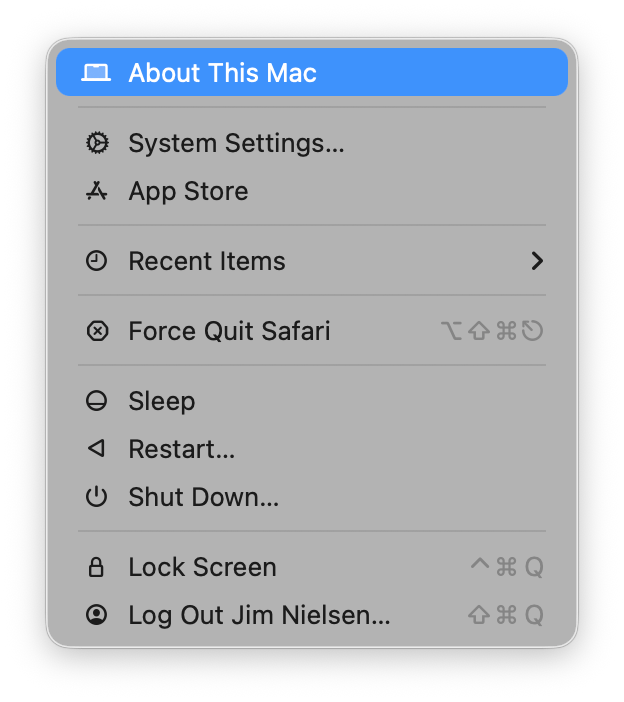
Menus in macOS Tahoe
Tahoe now has icons in menus everywhere. For example, here’s the Apple menu:
Safari
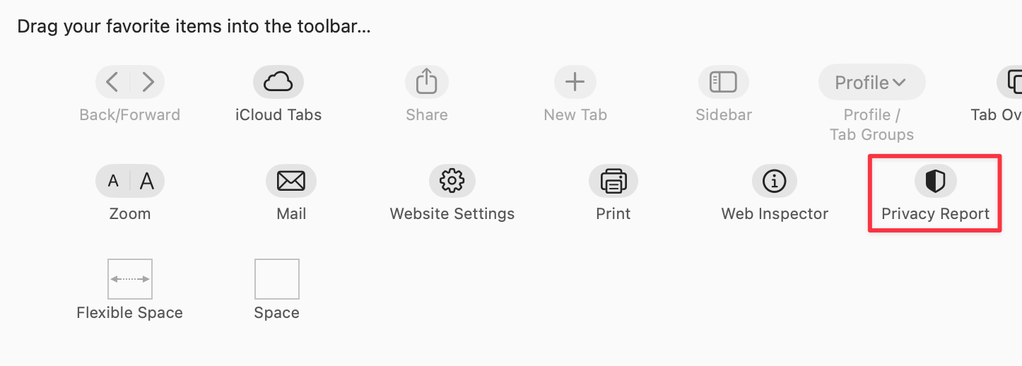
Looking at the Safari menu:

We see icons for roughly half the items. For instance, the “Settings” menu item (third from the top) has an icon, while the adjacent “Privacy Report” does not— even though Safari’s Customize Toolbar UI shows an icon for Privacy Report:
File menu
The File menu in Safari shows a mixed pattern:
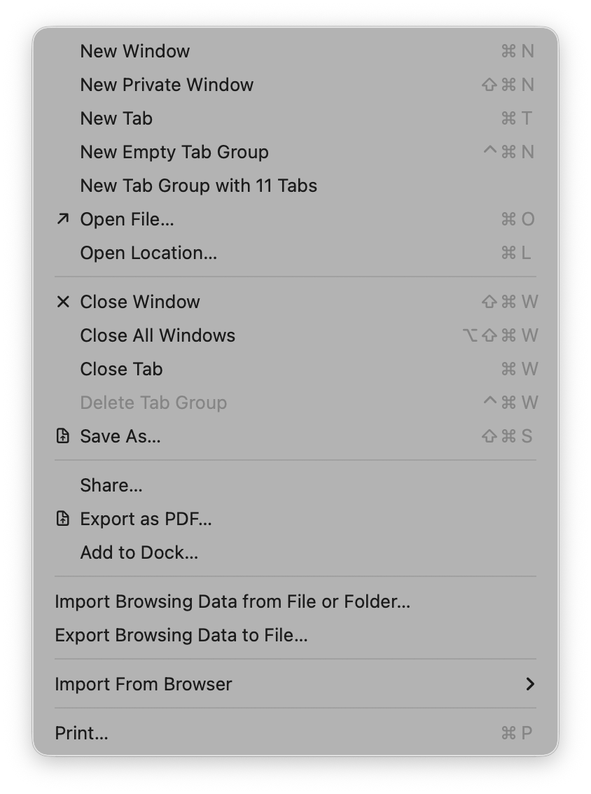
Some groupings have icons and are inset; others lack icons and remain flush. The rationale isn’t clear.
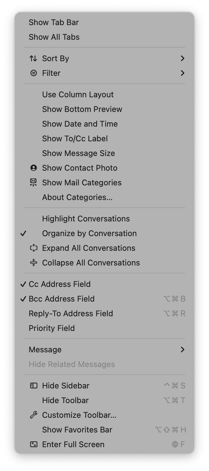
View menu
The View menu adds another layer of complexity with toggles (checkmarks) alongside icons:
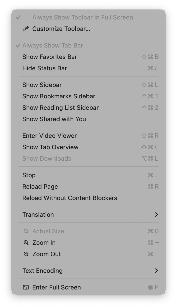
The Mail app’s View menu exhibits the same mix of:
- Text only
- Text + toggles
- Text + icons
- Text + icons + toggles
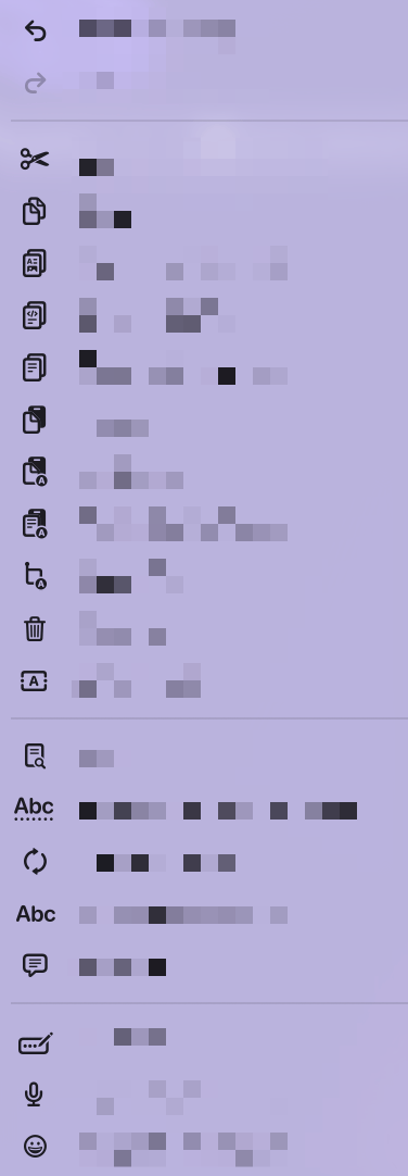
If you removed the textual labels, it would be a fun experiment to see how many people could still navigate correctly:
In many cases I can’t intuit why some items have icons and others do not. What do these icons afford me at the cost of extra visual and cognitive parsing? I don’t know.
Useful icons
Some menus make the icons genuinely helpful. In Finder, every menu item has an icon that conveys the window placement visually, which is far easier to process than reading “Top Left”, “Bottom & Top”, or “Quarters”.
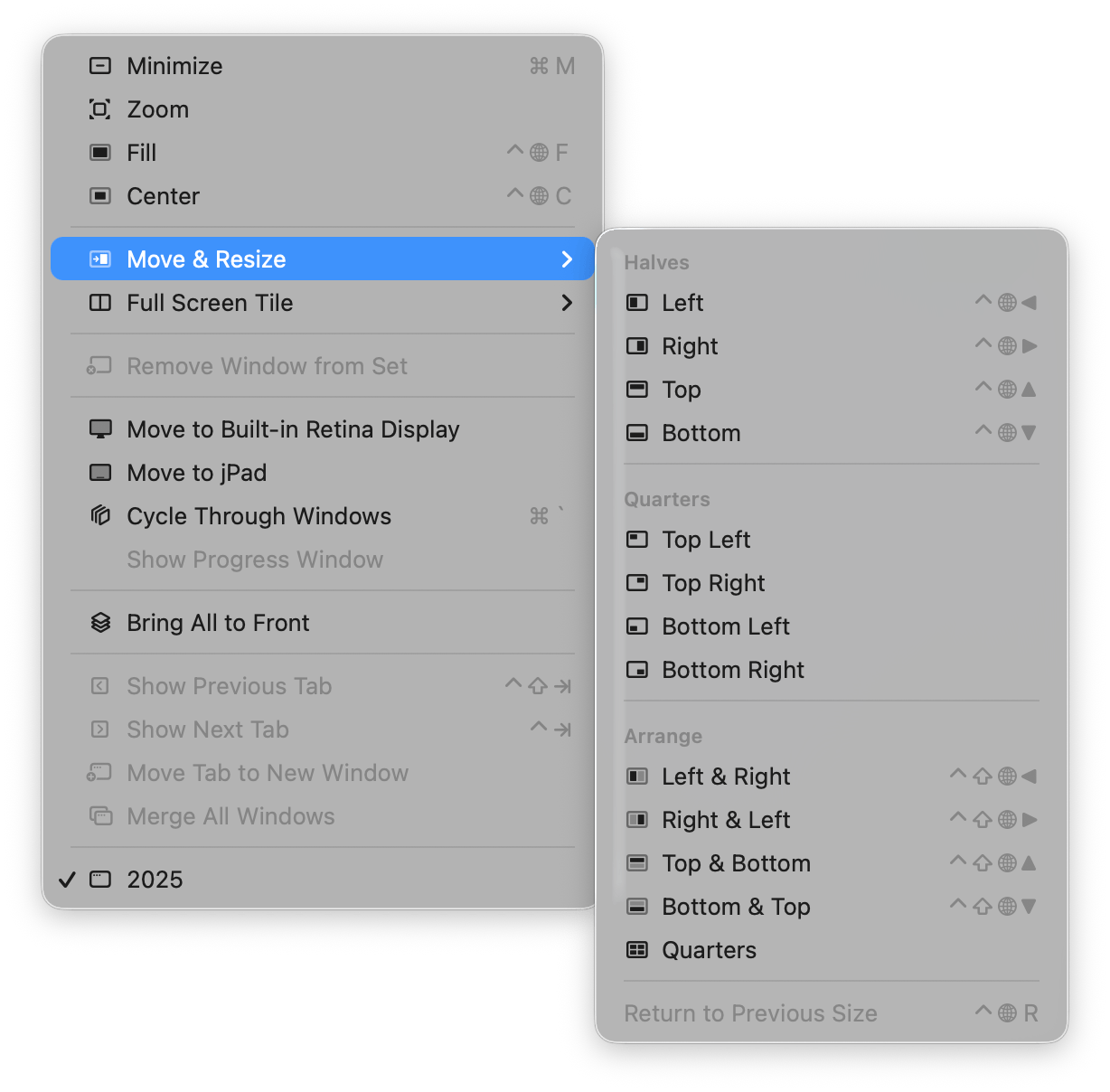
Those are good icons in menus—I like them.
Apple Abandons Its Own Guidance
What’s interesting is that Apple’s shift seems to contradict its own Human Interface Guidelines. As Peter Gassner pointed out, the 2005 (and earlier 1992, 2020) guidelines include a section titled “Using Symbols in Menus”:
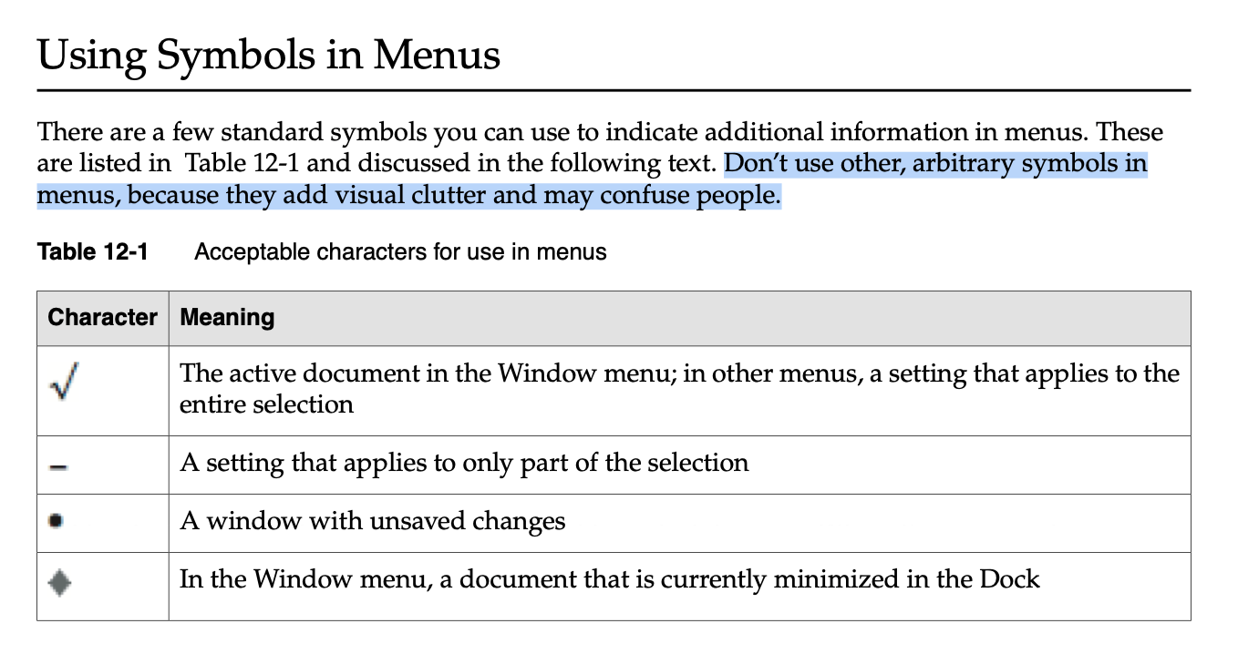
There are a few standard symbols you can use to indicate additional information in menus…
Don’t use other, arbitrary symbols in menus, because they add visual clutter and may confuse people.
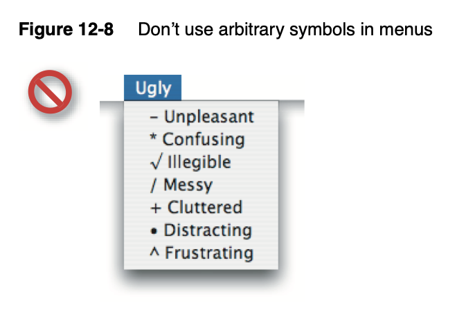
Apple even provides a “don’t do this” example, which looks exactly like a macOS Tahoe menu:
Conclusion
It’s pretty obvious how I feel: I’m tired of all this visual noise in my menus. With Apple now joining the “icon‑everywhere” crowd, it’s harder than ever to argue for a more restrained default. My suggestion is simple—unless you can articulate a strong reason for an icon, the default posture should be no icons in menus.
So this is the world I live in now: icons in menus. Icons in menus everywhere.
Send help.