How to Generate and Customize Word Charts Using C#
Source: Dev.to
Generating reports and visualizing data
Generating reports and visualizing data are crucial tasks in many business applications. While Microsoft Word is a ubiquitous tool for document creation, manually embedding and updating charts can be tedious and error‑prone. This tutorial demonstrates how to programmatically create and customize charts within Word documents using C# and the Spire.Doc for .NET library.
Setting Up Your Environment
To create charts in Word documents programmatically, you need a library that can manipulate Word files without requiring Microsoft Office. Spire.Doc for .NET provides comprehensive functionalities for Word document manipulation, including chart creation.
Installation via NuGet
- Create a new project – Open Visual Studio and create a new C# Console Application (.NET Core or .NET Framework).
- Install the NuGet package
- Right‑click the project in Solution Explorer → Manage NuGet Packages…
- In the Browse tab, search for
Spire.Doc. - Select
Spire.Docand click Install.
After installation, you’ll have access to all necessary classes and methods for working with Word documents and charts.
Understanding Chart Types and Data Series
Before diving into code, it’s helpful to know the basic components of a chart: chart types and data series. Spire.Doc supports a wide array of chart types commonly found in Microsoft Word.
Common Chart Types
- Bar/Column Charts – Compare values across categories.
- Line Charts – Show trends over time or ordered categories.
- Pie Charts – Display proportions of a whole.
- Bubble Charts – Visualize three dimensions of data (X, Y, and size).
These types are enumerated in Spire.Doc.Fields.Shapes.Charts.ChartType.
Data Series
A data series is a group of related data points plotted in a chart. Typical elements:
- Categories (Labels) – Textual descriptions for each data point (e.g., months, product names).
- Values – Numerical data corresponding to each category.
- Additional Values – Required for certain chart types (e.g., bubble sizes).
Use ChartSeriesCollection and ChartSeries to manage and add data series.
Step‑by‑Step Chart Creation
Below is a walkthrough for creating a simple pie chart, followed by an example of a bubble chart.
1. Initialize Document and Section
using Spire.Doc;
using Spire.Doc.Documents;
using Spire.Doc.Fields;
using Spire.Doc.Fields.Shapes.Charts; // Required for Chart and ChartSeries

// Create a new Word document
Document doc = new Document();
Section section = doc.AddSection();
Paragraph paragraph = section.AddParagraph();
2. Append the Chart Shape
// Append a pie chart (width 500, height 300)
ShapeObject shape = paragraph.AppendChart(ChartType.Pie, 500.0f, 300.0f);
Chart chart = shape.Chart; // Retrieve the Chart object
Note: Use the full namespace
Spire.Doc.Fields.Shapes.Charts.Chartif you encounter naming conflicts.
3. Add Data Series
// Clear any existing series (good practice for new charts)
chart.Series.Clear();
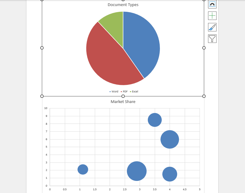
// Define categories and values
string[] categories = { "Word", "PDF", "Excel" };
double[] dataValues = { 2.7, 3.2, 0.8 };
// Add a series to the chart
ChartSeries series = chart.Series.Add("Document Types", categories, dataValues);Example: Bubble Chart Creation
Paragraph newPara = section.AddParagraph();

// Append a bubble chart
ShapeObject bubbleShape = newPara.AppendChart(ChartType.Bubble, 500, 300);
Chart bubbleChart = bubbleShape.Chart;

bubbleChart.Series.Clear();

ChartSeries bubbleSeries = bubbleChart.Series.Add(
    "Market Share",
    new[] { 2.9, 3.5, 1.1, 4.0, 4.0 }, // X-values
    new[] { 1.9, 8.5, 2.1, 6.0, 1.5 }, // Y-values
    new[] { 9.0, 4.5, 2.5, 8.0, 5.0 }  // Bubble sizes
);
4. Save the Document
doc.SaveToFile("ChartInWordDocument.docx", FileFormat.Docx);The Generated Word Document
Advanced Customization
Spire.Doc offers extensive options for customizing chart appearance and behavior.
Chart Title
void AppendChartTitle(Chart chart)
{
    ChartTitle title = chart.Title;
    title.Show = true;
    title.Overlay = false; // Set to true if the title should overlap the plot area
    title.Text = "Quarterly Software Usage";
    title.CharacterFormat.FontSize = 12;
    // Additional formatting can be applied here
}
You can further customize axes, legends, data labels, colors, and more using the properties available on the Chart object.