How to Create a Striking Grayscale Effect
Source: Dev.to
Introduction
In this post we will create a striking grayscale effect by examining grayscale, thresholds, and S‑curves.
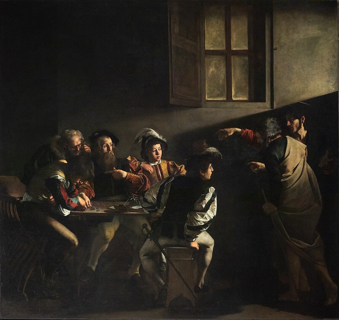
For this demonstration we will convert The Calling of Saint Matthew by Caravaggio into grayscale. Caravaggio’s paintings are striking in their use of light, and we aim to preserve that quality while transforming the masterwork to grayscale.
A Simple Grayscale
First, we use the grayscale tool provided by BrushCue. The tool converts each pixel from RGB to an XYZ color space, extracts the luminance (the Y component), and sets the X and Z values to 0 to create a grayscale image.
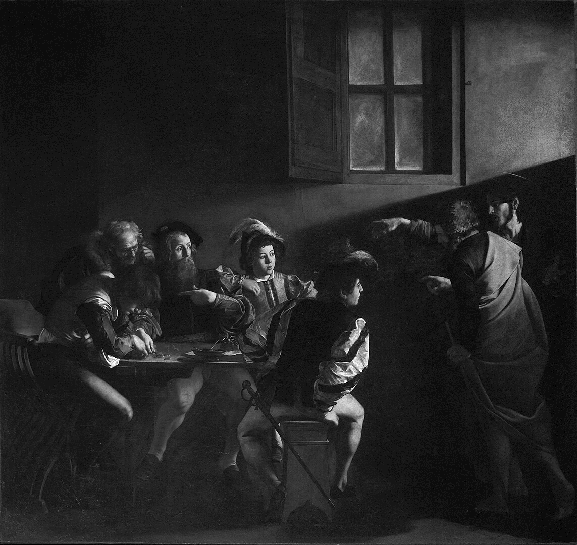
While technically correct, this result is far from striking; the image appears too gray for many tastes.
Using a Threshold
To increase contrast, we can push colors to either white or black using the Lightness Threshold tool.
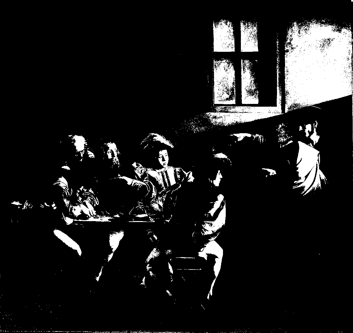
This maximizes contrast but produces an extreme, binary look that isn’t the desired effect. We need something between a normal grayscale and a full threshold.
Using a Lightness S‑Curve
An S‑Curve can boost contrast by pulling values toward 0 (black) and 1 (white) while preserving detail. The curve’s input (x‑axis) maps to output (y‑axis); values below 0.5 are darkened, and values above 0.5 are lightened.
The interactive component in the original post demonstrates this concept.
BrushCue’s Composition Lightness Curve operation implements the S‑Curve. You can experiment with it via the High Contrast Grayscale tool.
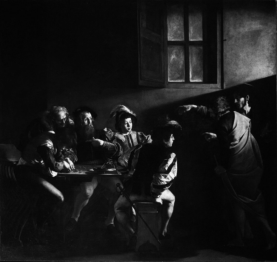
The result shows a striking difference between dark and light areas while still preserving the detail of a standard grayscale. This approach offers a compelling way to enhance grayscale images without losing nuance.