How Analysts Translate Messy Data,DAX,and Dashboards into Action Using Power BI.
Source: Dev.to
Introduction
Power BI helps analysts turn messy data into clear insights that support real business decisions.
Key activities include
- Cleaning data – removing duplicates, fixing errors, standardising formats.
- Using DAX for analysis and calculations.
- Building dashboards to visualise results.
Power BI views
- Table view
- Report view
- Model view

Messy Data → Meaningful Data
Real‑world data is rarely perfect. It may come from multiple sources, contain missing columns, or have inconsistent values (e.g., country names spelled differently, empty revenue fields).
Using Power BI and Power Query, analysts can:
- Remove duplicates.
- Fix errors.
- Standardise formats.
Poor‑quality data leads to incorrect insights and bad business decisions. Clean data provides a trustworthy foundation for analysis.
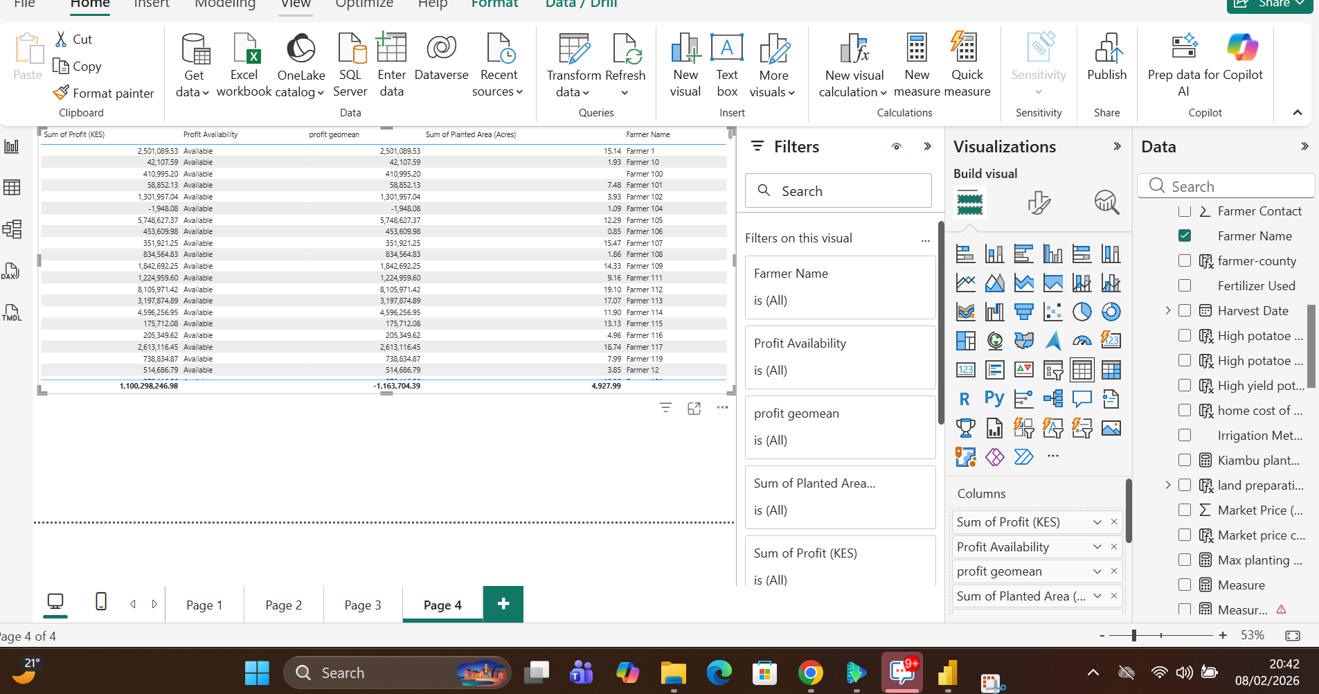
Below is an example of a raw dataset transformed into a clean, analysis‑ready model using Power Query and DAX calculated columns.


DAX Functions to Answer Business Questions
After the data is prepared, DAX (Data Analysis Expressions) is used to create calculations that answer real‑world questions. These calculations are typically defined as measures.
Common DAX Measures
Total – returns the total count or sum of a column.

Average – calculates the mean value (e.g., average sales).

Other useful functions
SUMX/SUMIFAVERAGEX/AVERAGEIFMEDIANIF/SWITCH- Date functions (
YEAR,MONTH,DATESYTD, etc.)
These measures are visualised in the Report view using charts, tables, and other visuals.

DAX functions help us track trends, identify outliers, and spot potential problems early.
Dashboards
Dashboards present the insights derived from the data in a concise, story‑telling format. They combine Power BI charts, tables, and KPIs to enable quick decision‑making.
KPIs

Charts

Tables
Power BI helps bridge the gap between raw data and real‑world action. By cleaning messy data, using DAX to create meaningful calculations, and building intuitive dashboards, analysts enable organizations to make smarter decisions.