Google just can’t stop tweaking YouTube Music’s Now Playing screen
Published: (April 15, 2026 at 04:41 AM EDT)
2 min read
Source: Android Authority
Source: Android Authority
TL;DR
- YouTube Music is getting a redesigned Now Playing interface.
- Google has replaced the Song/Video toggle with icons and moved some elements, so you’ll need to relearn how to use the screen.
What’s new
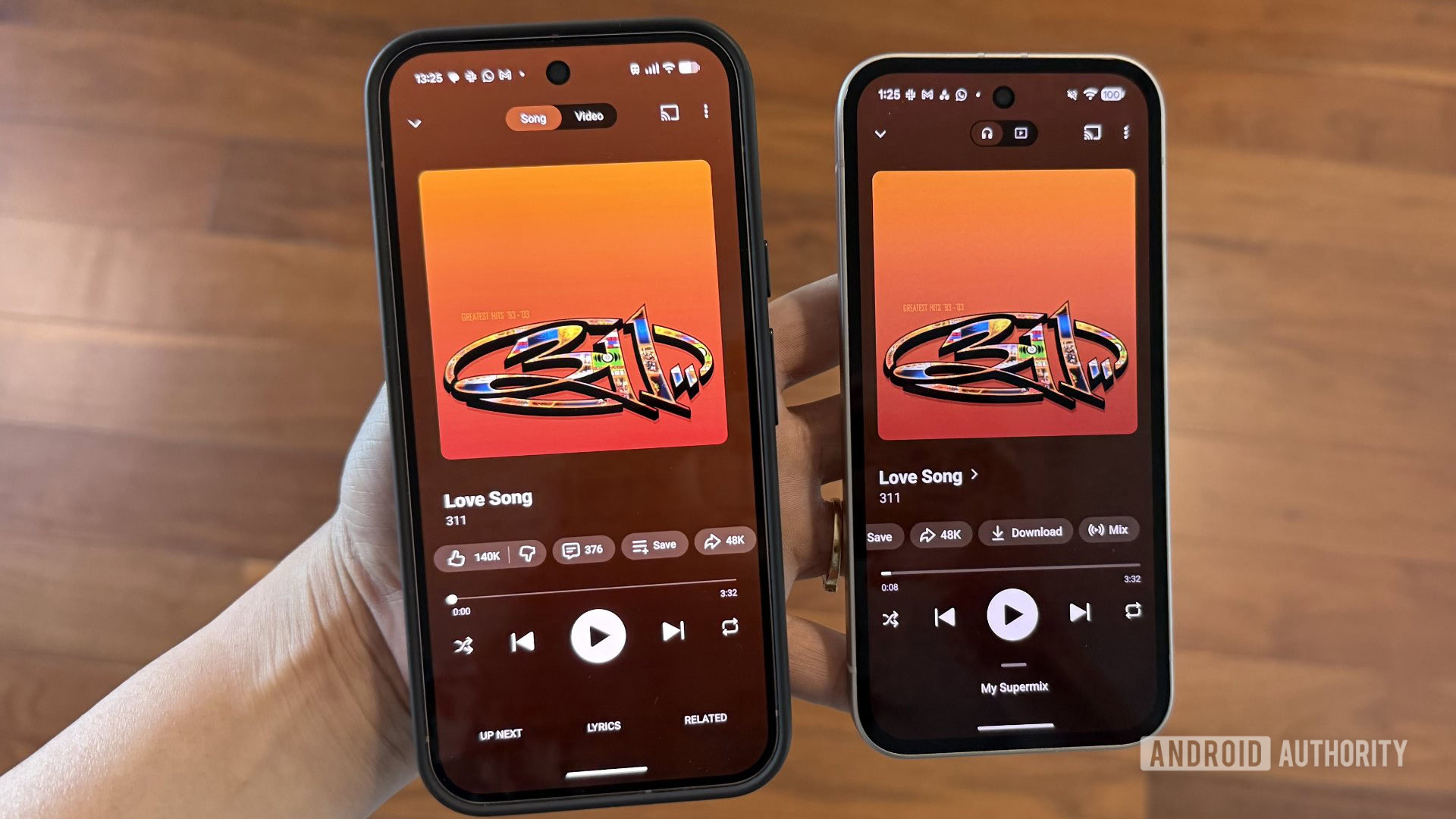
YouTube Music’s Now Playing screen has been refreshed with a split‑screen view, new placement for several features, and a few visual tweaks.
Top of the player
- The Song/Video toggle is now much smaller and uses representative icons instead of text.
Bottom of the screen
- The “Lyrics” and “Related” tabs have been removed from the bottom bar.
- That space now shows your Up Next queue.
You can swipe up anywhere on the player to reveal the queue in a half‑screen view; swiping down returns you to the full‑screen player layout.
Accessing Lyrics and Related content
- Lyrics are now located next to the like/dislike button.
- The Related section is hidden behind the song title menu. Tap the title and the arrow icon beside it to see recommended playlists, related tracks, similar artists, and more.
Playback controls
- The main playback controls and button carousel remain in the same place.
- The progress bar is slightly thicker and expands further when you tap or drag it.
Availability
The redesign is rolling out widely on Android (version 9.14 of the YouTube Music app) and on iOS. Some users may need to force‑stop the app for the changes to appear, as this is a server‑side update.