Customizable “Toast-like” Notification via openCustomDialog (Font Size & Panel Size)
Published: (March 15, 2026 at 09:28 PM EDT)
2 min read
Source: Dev.to
Source: Dev.to
Customizable “Toast-like” Notification via openCustomDialog (Font Size & Panel Size)
Requirement Description
Provide a Toast-like transient message that allows custom font size and panel width/height/border radius/background, which the built-in openToast API does not expose.
Background Knowledge
Toast (Instant Feedback): temporary feedback UI.
Guide:Global custom dialog (UIContext): recommended for richer, app‑wide prompts via
PromptAction.openCustomDialog.
Guide:Toast API limitation:
UIContext.getPromptAction().openToastdoes not provide font size or panel sizing.
API reference:
Implementation Steps
- Use a builder to compose the Toast content (e.g.,
Textwith customfontSize, color, alignment). - Open a non‑modal custom dialog with
openCustomDialog, passing width/height/cornerRadius/backgroundColor. - Auto‑dismiss after a short delay using
closeCustomDialog.- Keep it non‑modal and center‑aligned with an offset to mimic Toast behavior.
Code Snippet / Configuration
let customDialogId: number = 0
@Builder
function customDialogBuilder() {
Column() {
// Fully customizable typography & colors
Text('Custom Toast').fontSize(20).fontColor('#fff')
}
.width('100%')
.height('100%')
.justifyContent(FlexAlign.Center)
.alignItems(HorizontalAlign.Center)
}
@Entry
@Component
struct Index {
@Builder
customDialogComponent() {
customDialogBuilder()
}
build() {
Row() {
Column() {
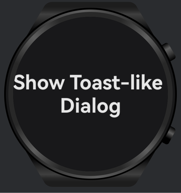
Text('Show Toast-like Dialog')
.fontSize(30)
.fontWeight(FontWeight.Bold)
.onClick(() => {
this.getUIContext().getPromptAction().openCustomDialog({
builder: () => this.customDialogComponent(),
// Visual container controls (Toast‑like panel)
backgroundColor: 'rgba(0,0,0,0.8)',
backgroundBlurStyle: BlurStyle.NONE,
cornerRadius: 5,
width: '50%', // panel width
height: 50, // panel height
isModal: false, // non‑modal, like Toast
alignment: DialogAlignment.Center,
offset: { dx: 0, dy: 100 }
}).then((dialogId: number) => {
customDialogId = dialogId
setTimeout(() => {
this.getUIContext().getPromptAction().closeCustomDialog(customDialogId)
}, 1500)
})
})
}.width('100%')
}.height('100%')
}
}Test Results
- Verified that text font size and panel width/height/corner radius/background are fully controllable.
- Auto‑dismiss works reliably at ~1.5 s; interaction remains non‑blocking (non‑modal).
Limitations or Considerations
openToastis simpler but not customizable for typography or panel size; use it only for basic messages.- Use
openCustomDialogfor complex styling or branded toasts; ensure accessibility (contrast, size). - Consider safe‑area and device variations (round/compact screens on wearables).
Related Documents or Links
- Toast guide:
- Global custom dialog guide:
PromptAction.openToastAPI: